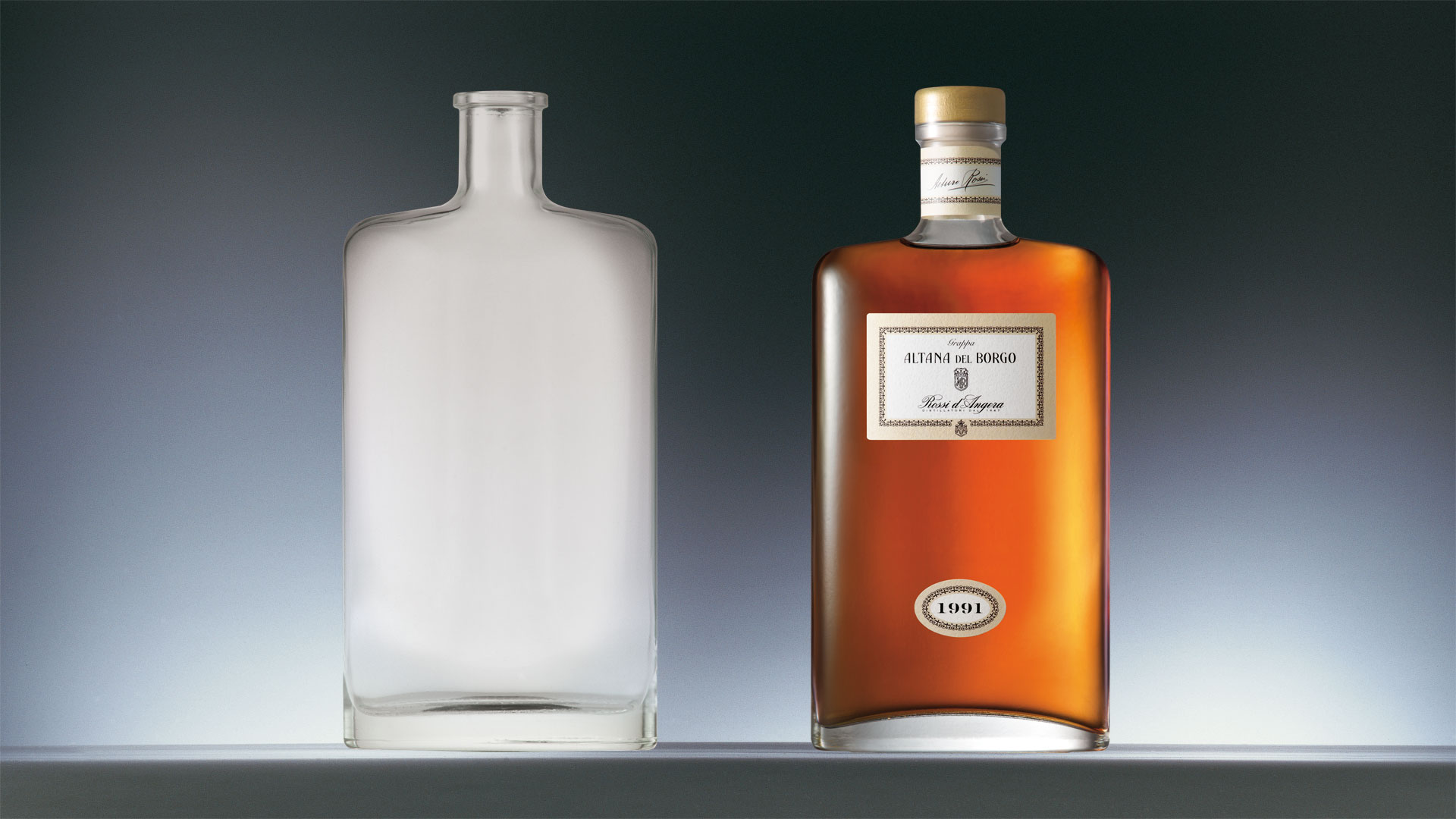
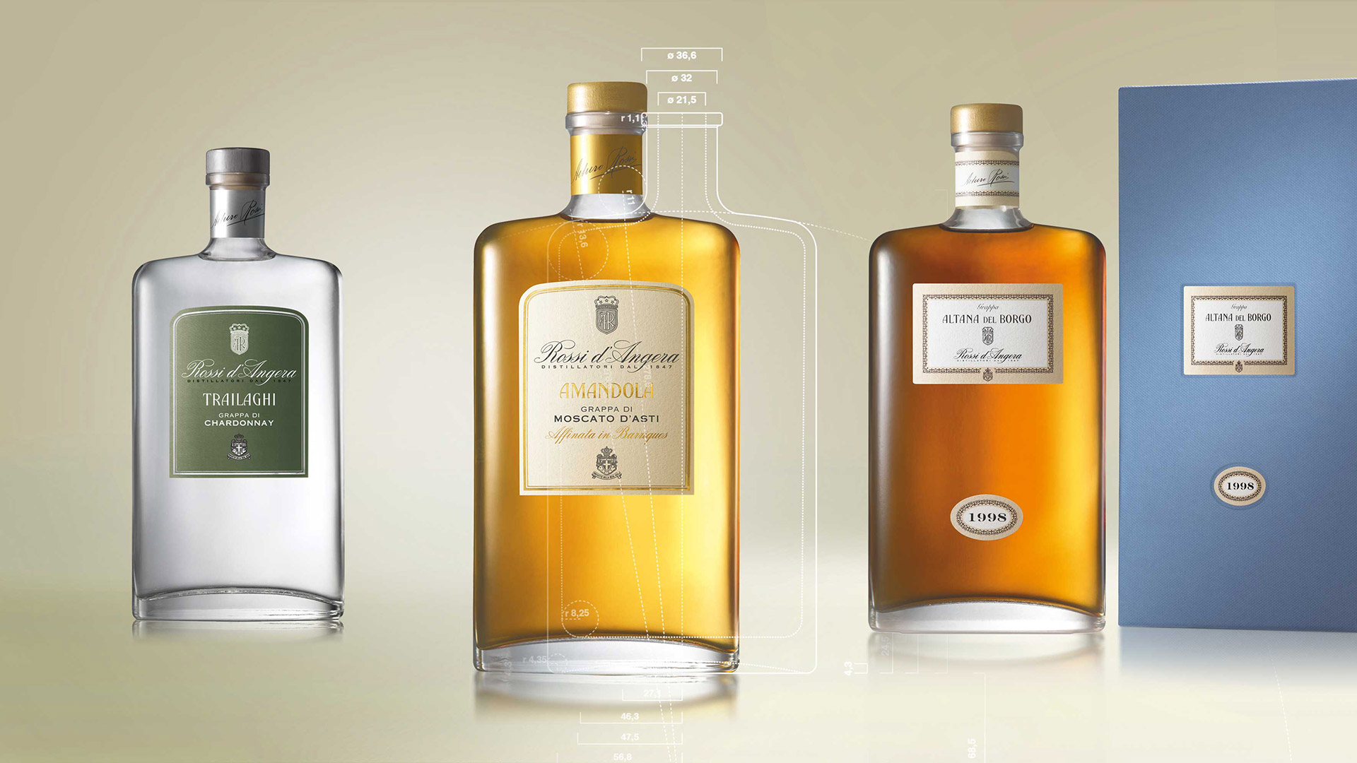
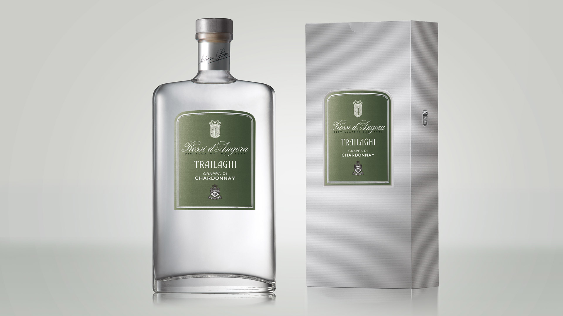
This case involved a conservative restyling project.
The bottle was redesigned with the aim of eliminating a number of critical elements. The sharp edges of the joints was replaced by softer lines, which in addition to improving the bottle aesthetically, also made it more ergonomical, while the proportions of the base surface were revised to make the bottle more stable. The result is a packaging that both preserves the references to the company’s history and yet opens an effective dialogue with the current consumer base.
Attività: Packaging, Bottle Design


