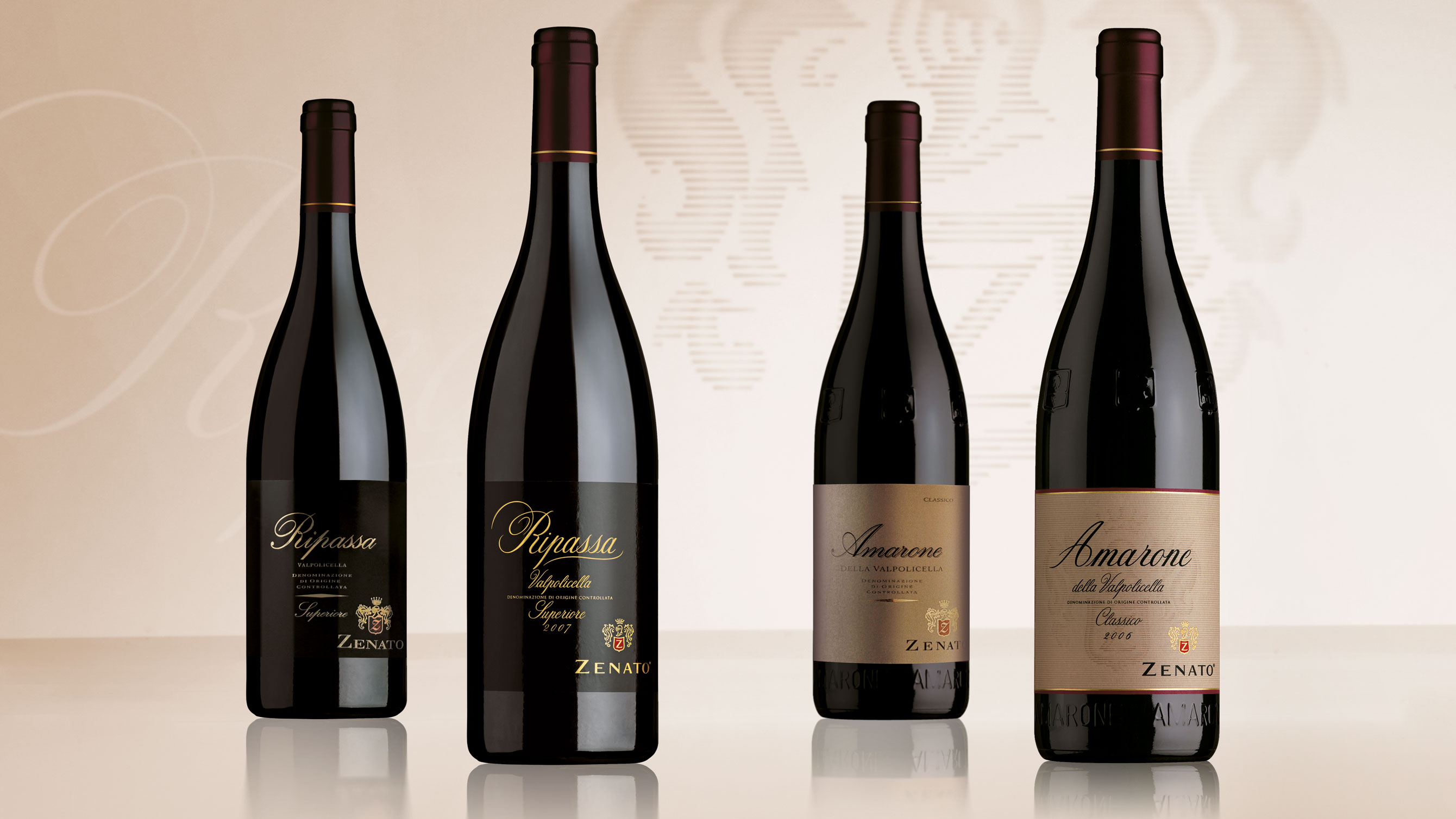
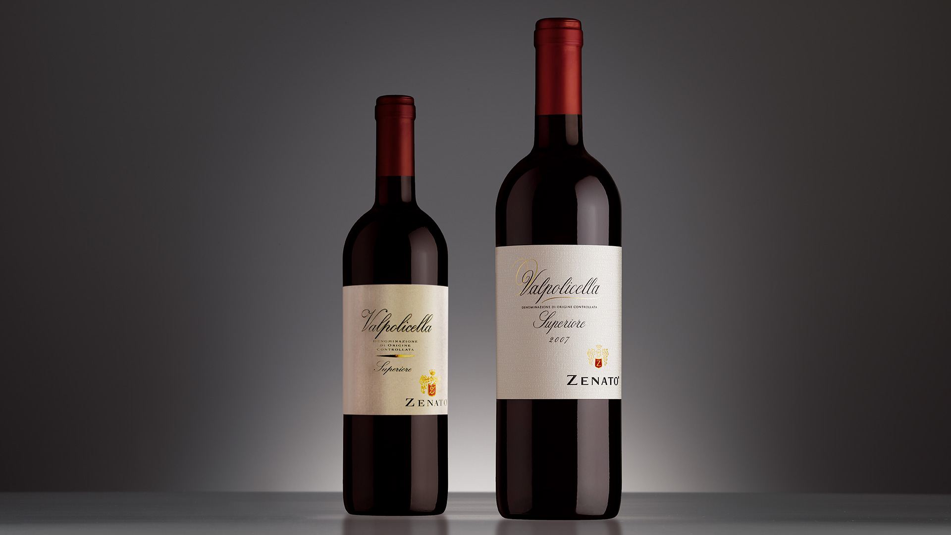
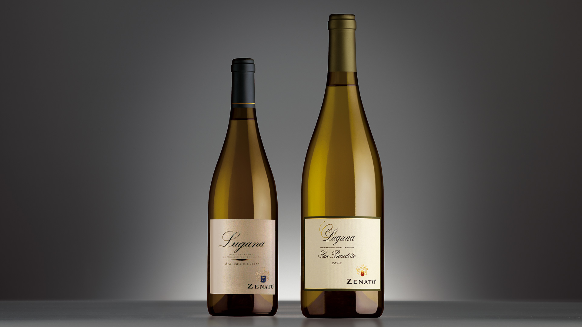
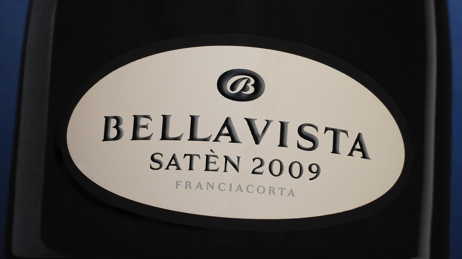
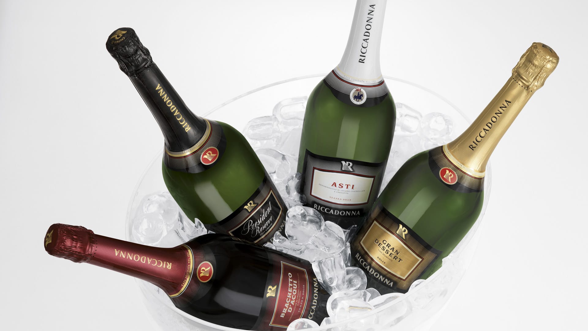
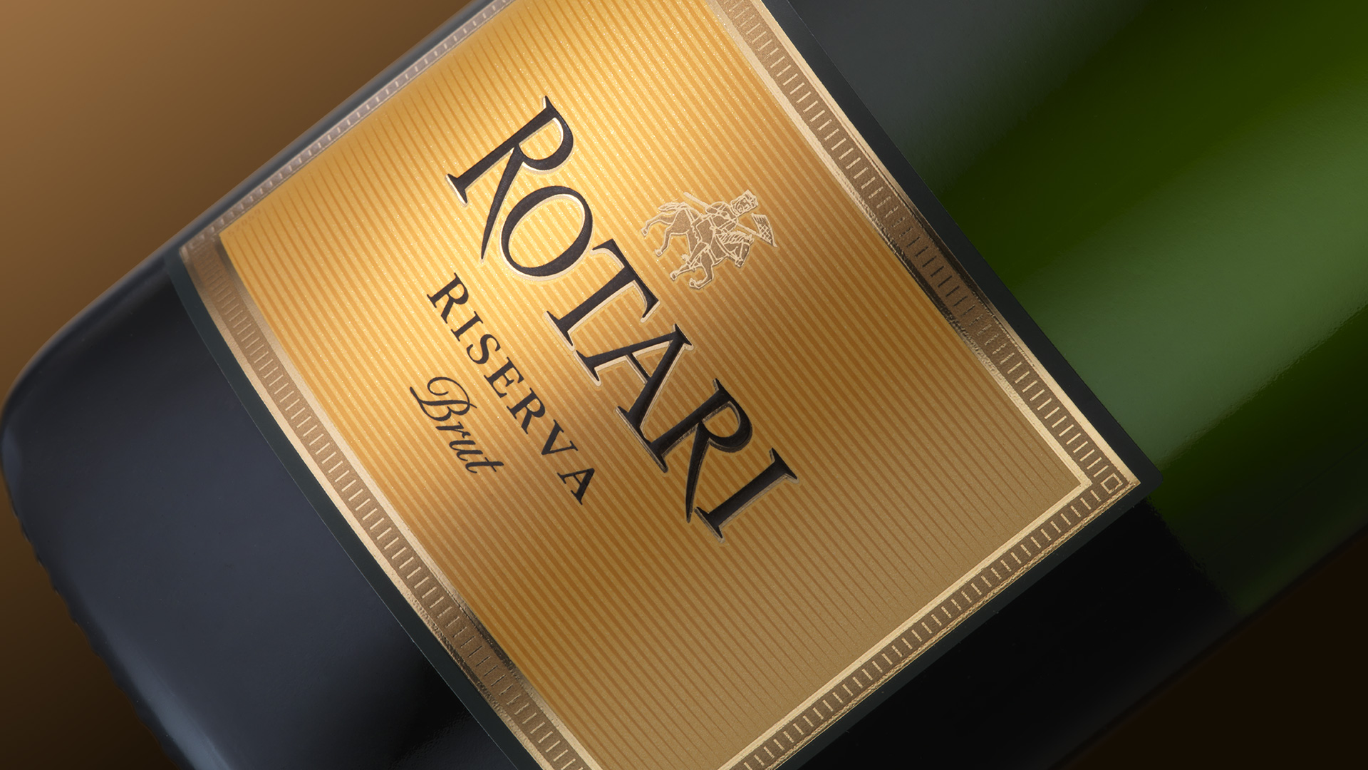
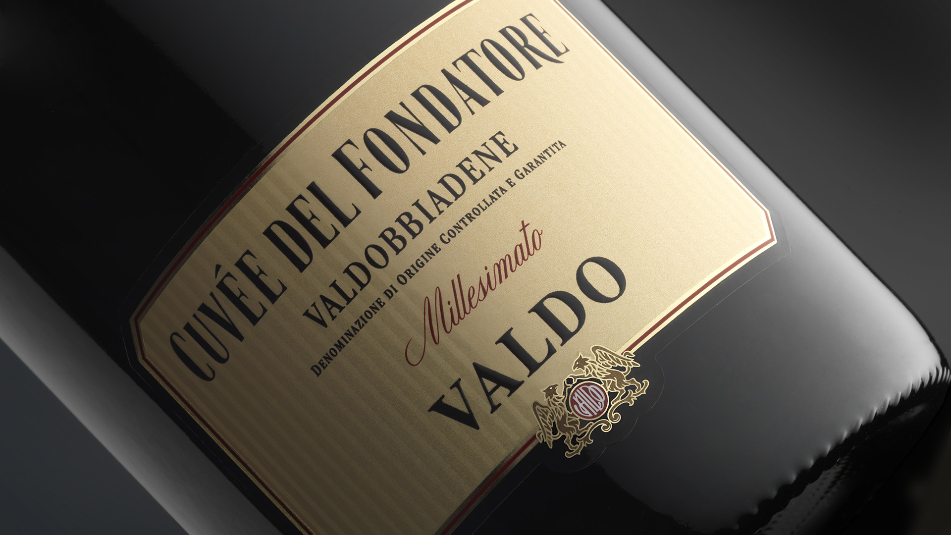
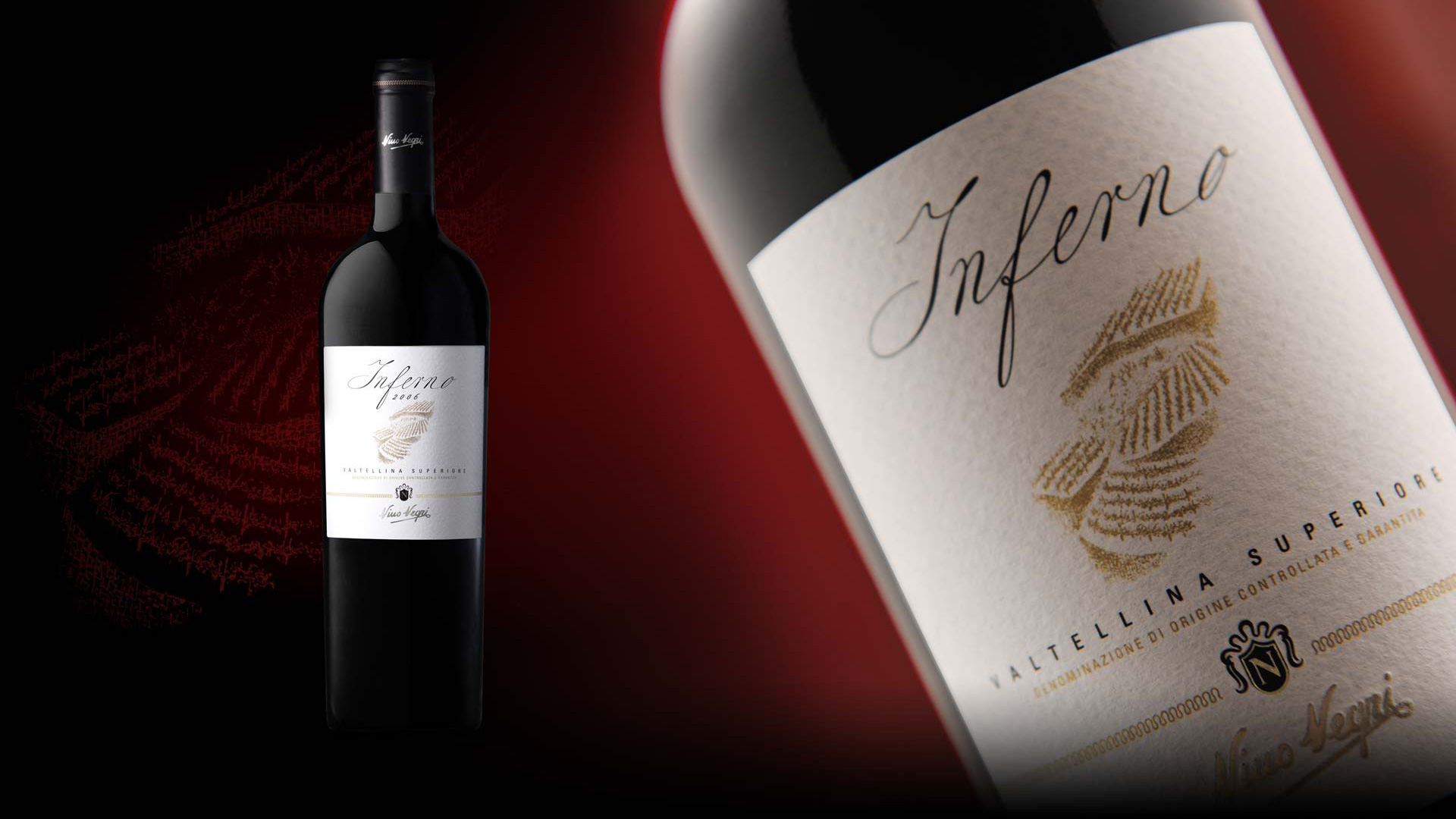
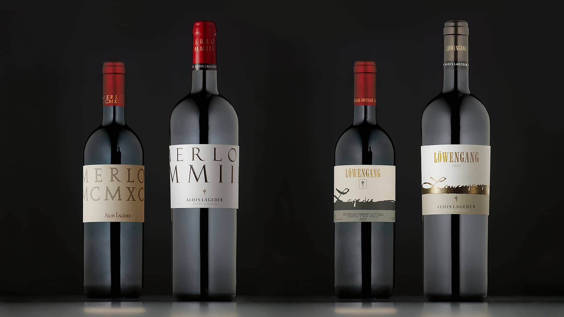
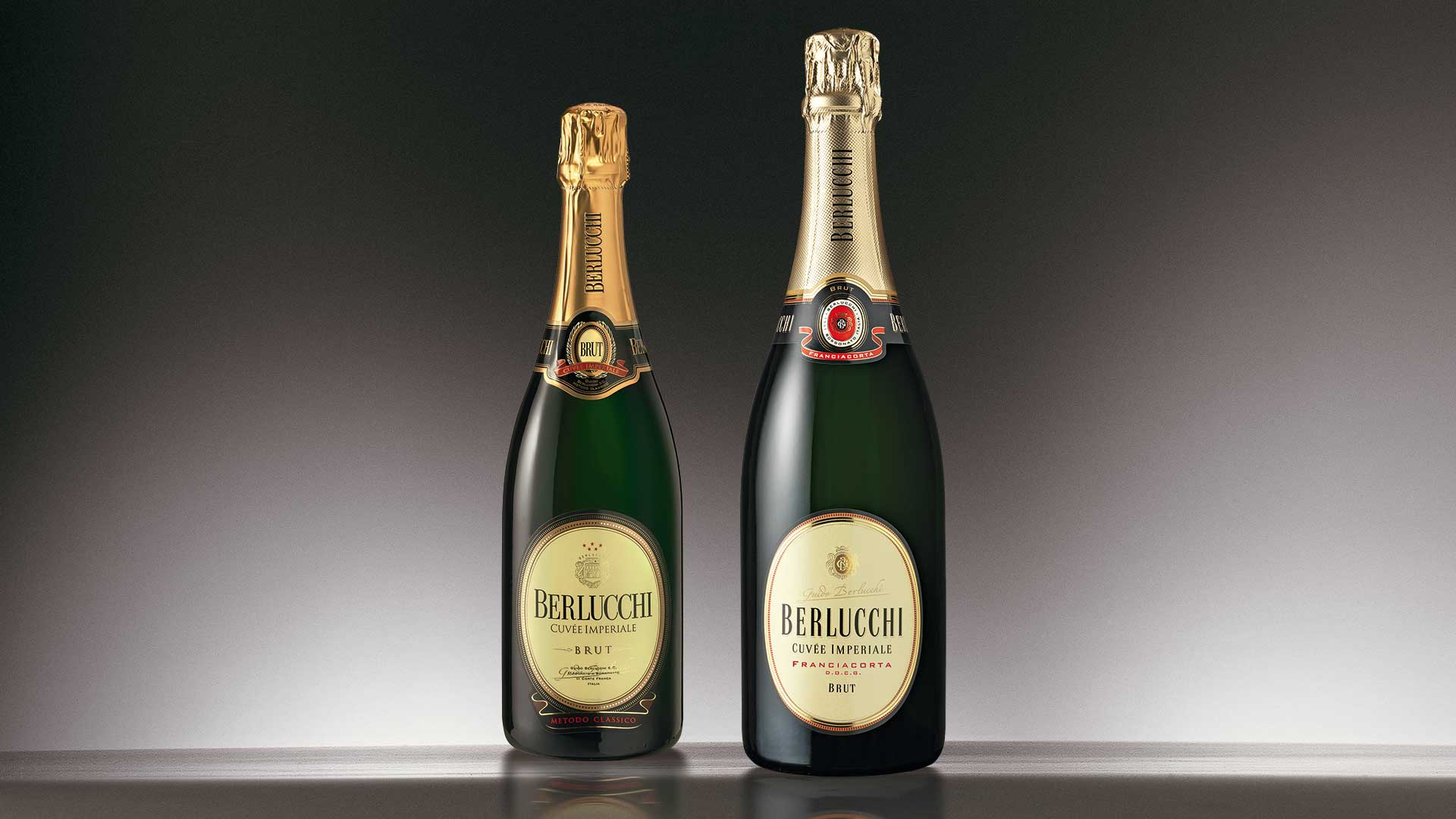
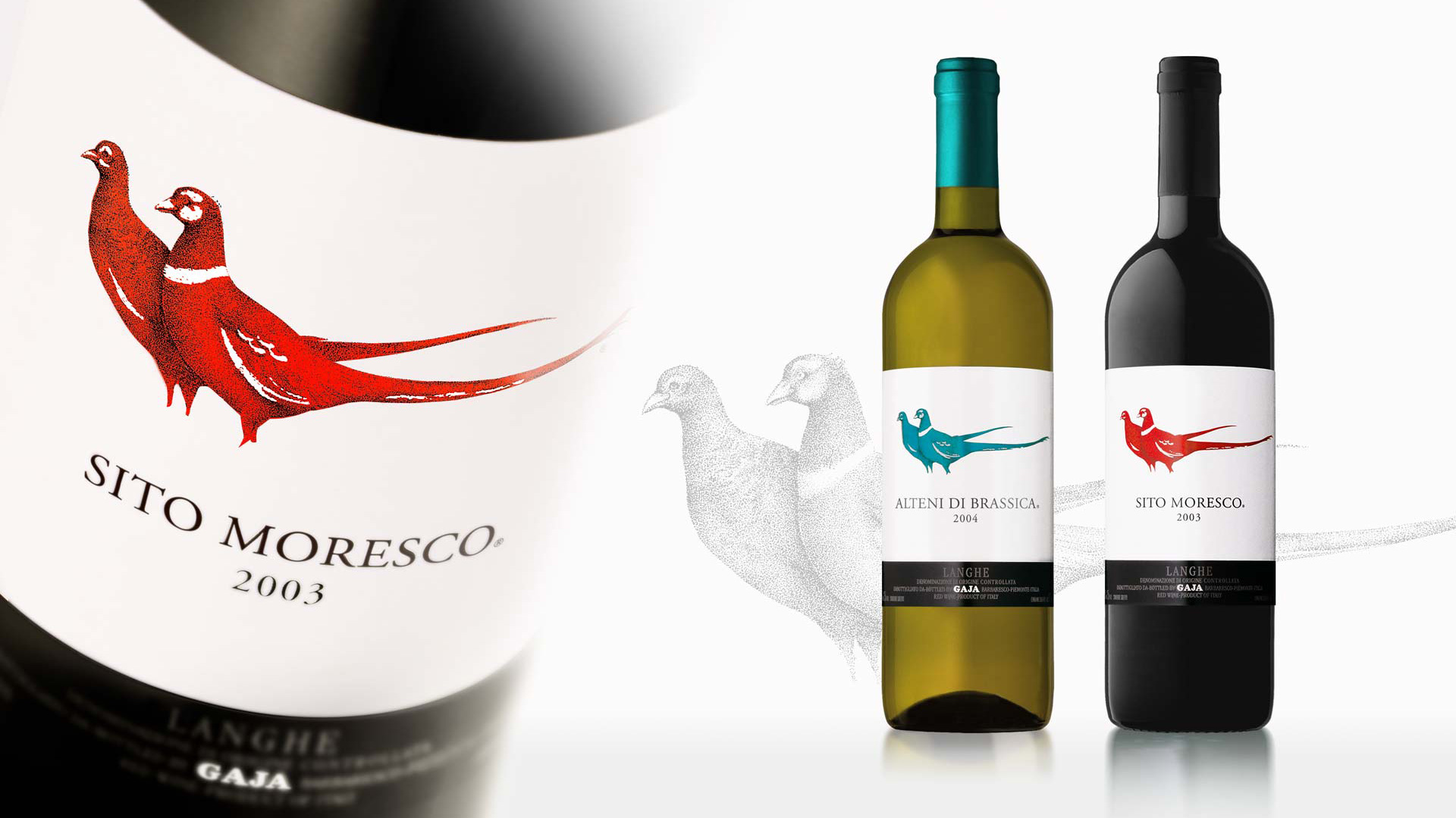
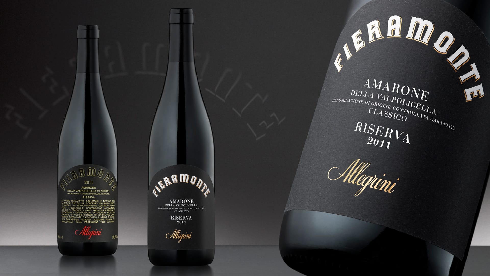
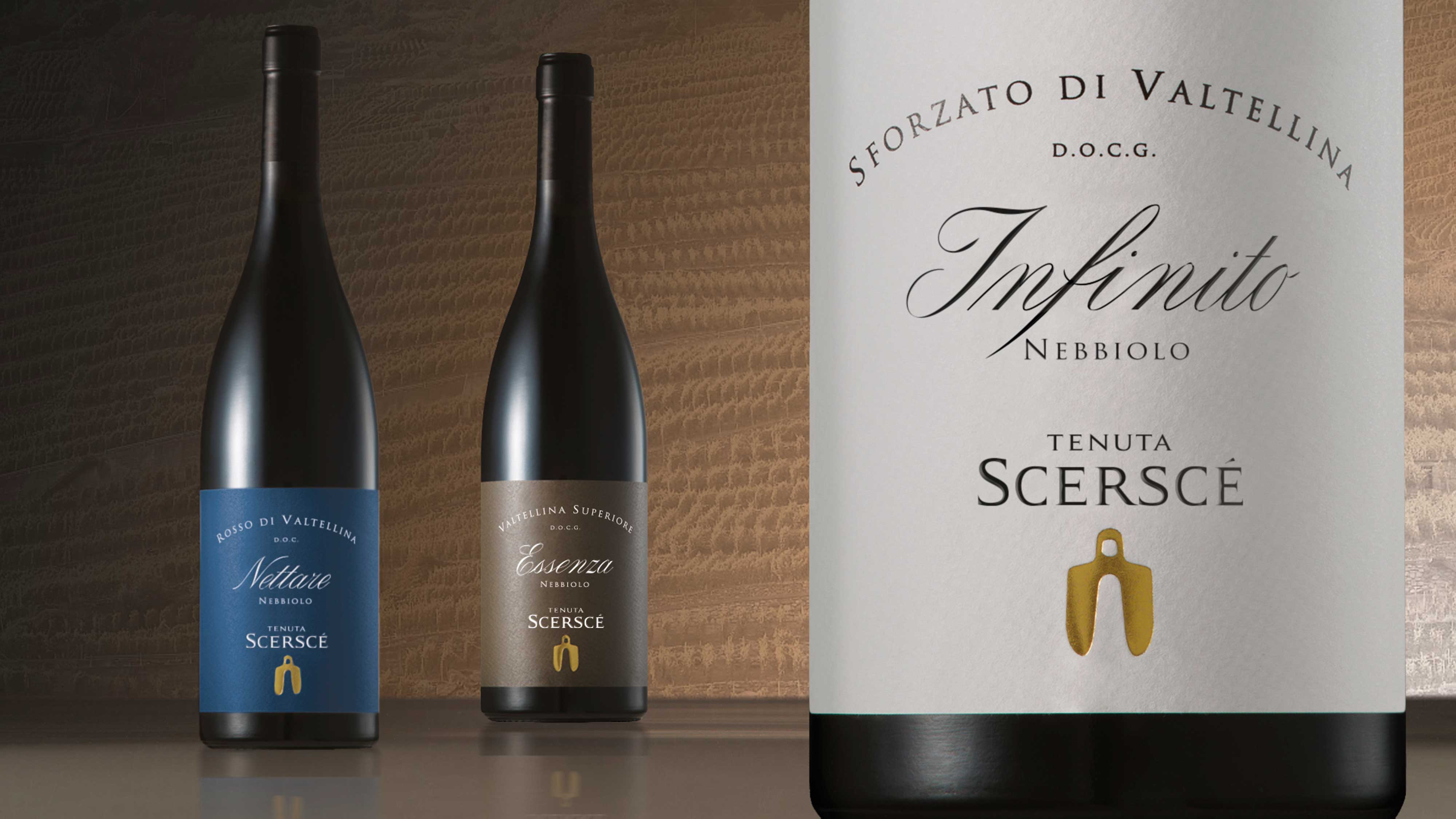
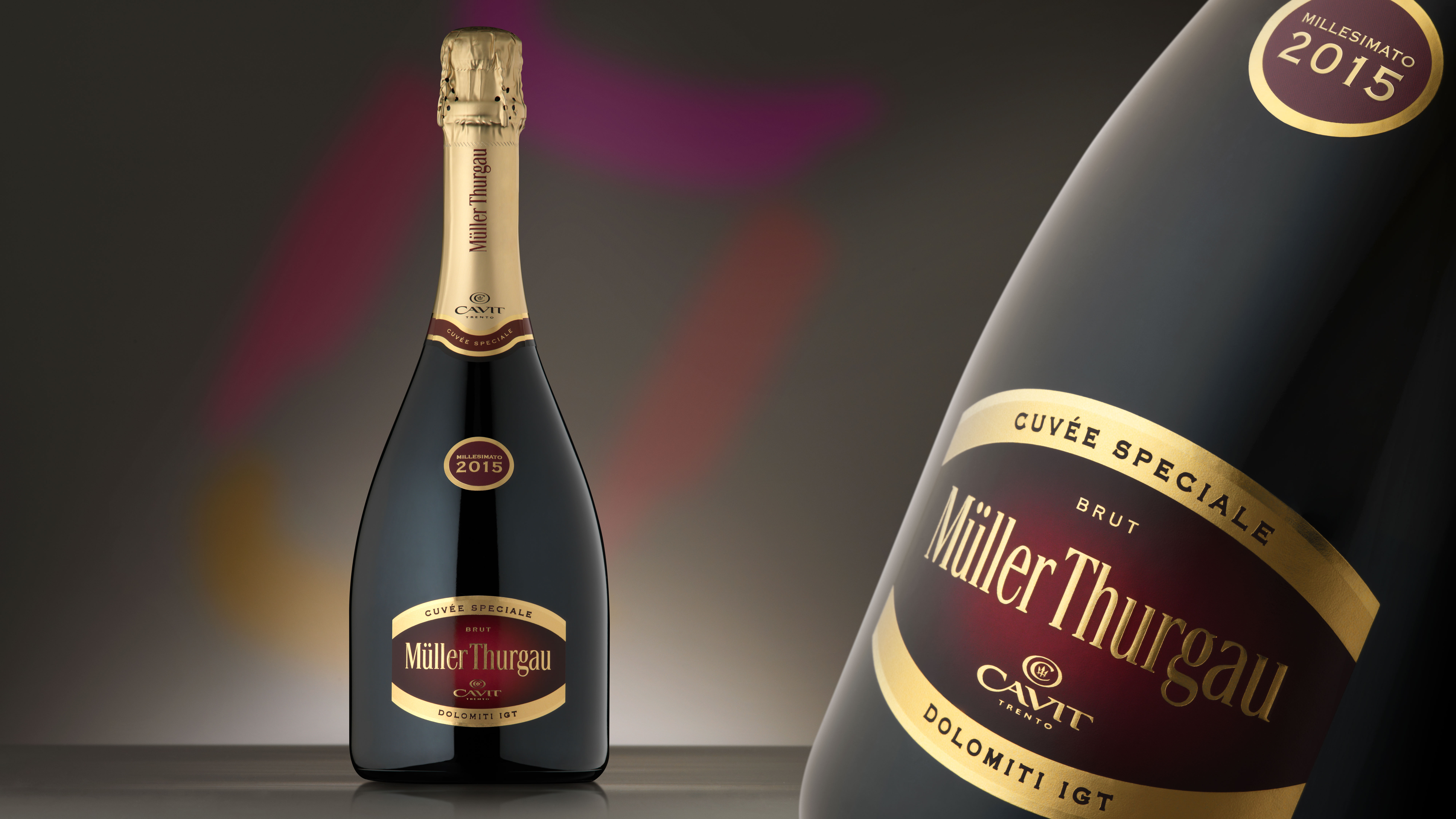
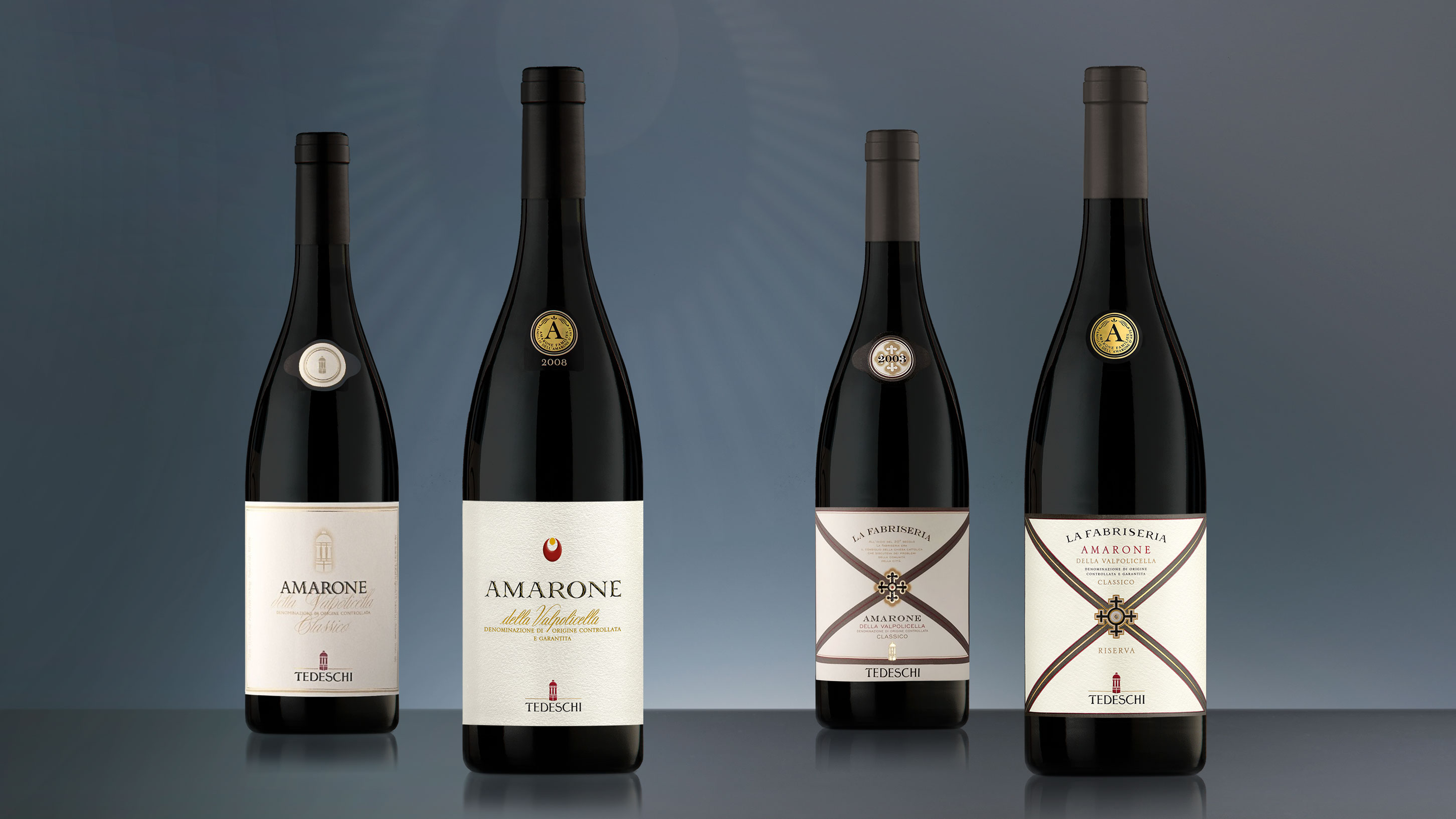
The restyling project for Zenato focused on the wines with the strongest bonds with tradition and, given the prestigious reputation of the company, the leading producer in the region, proceeded with a highly balanced intervention.
First we evolved the company brand to make it more striking and modern, then we designed an elegant and clearly legible new font.
In relation to the various levels of quality of the wines, we specified the respective positioning in detail through a careful calibration of the aesthetic elements that range from the quality of the paper, to the warm and engaging base colours; from the introduction of gold laminate to the use of refined textures.
Activity: Branding, Packaging, Secondary packaging, Restyling, Global Design e Naming
- Intervista a Nadia e Alberto Zenato Mostra fotografica VITE: il mondo del vino va in scena


