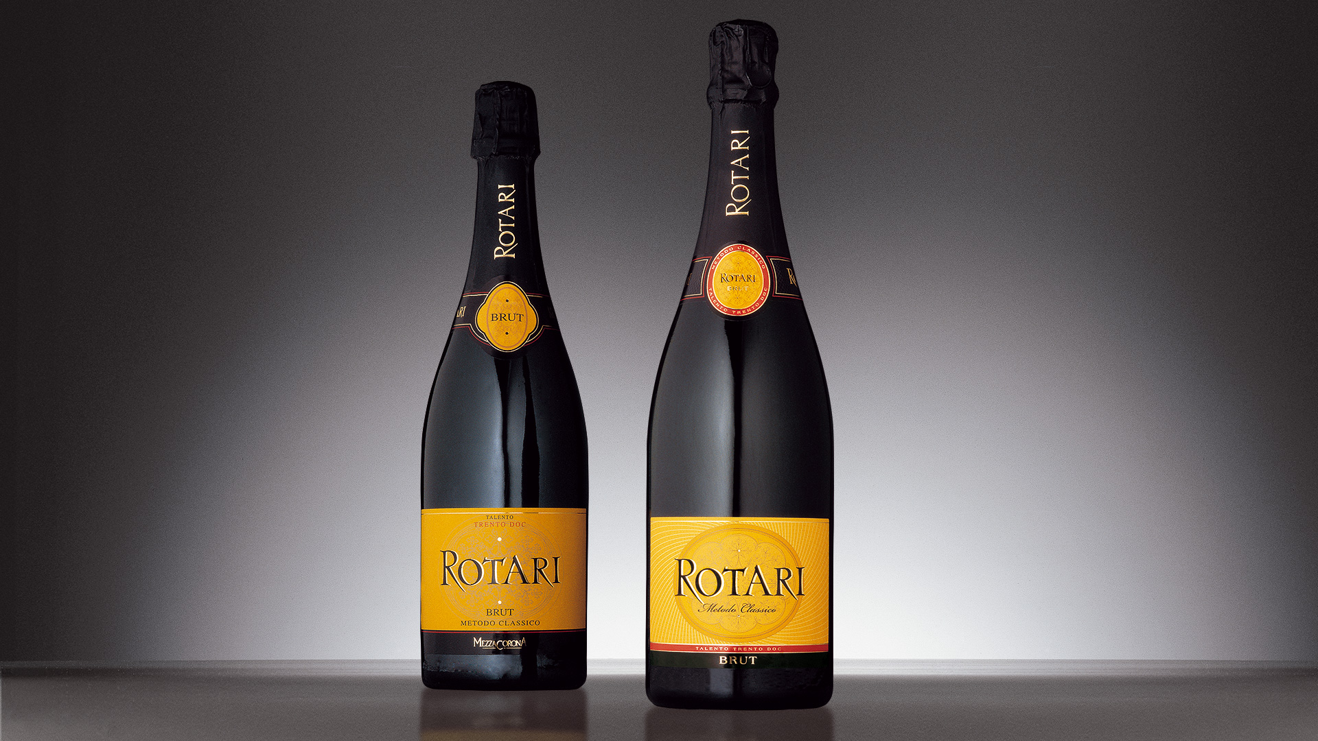
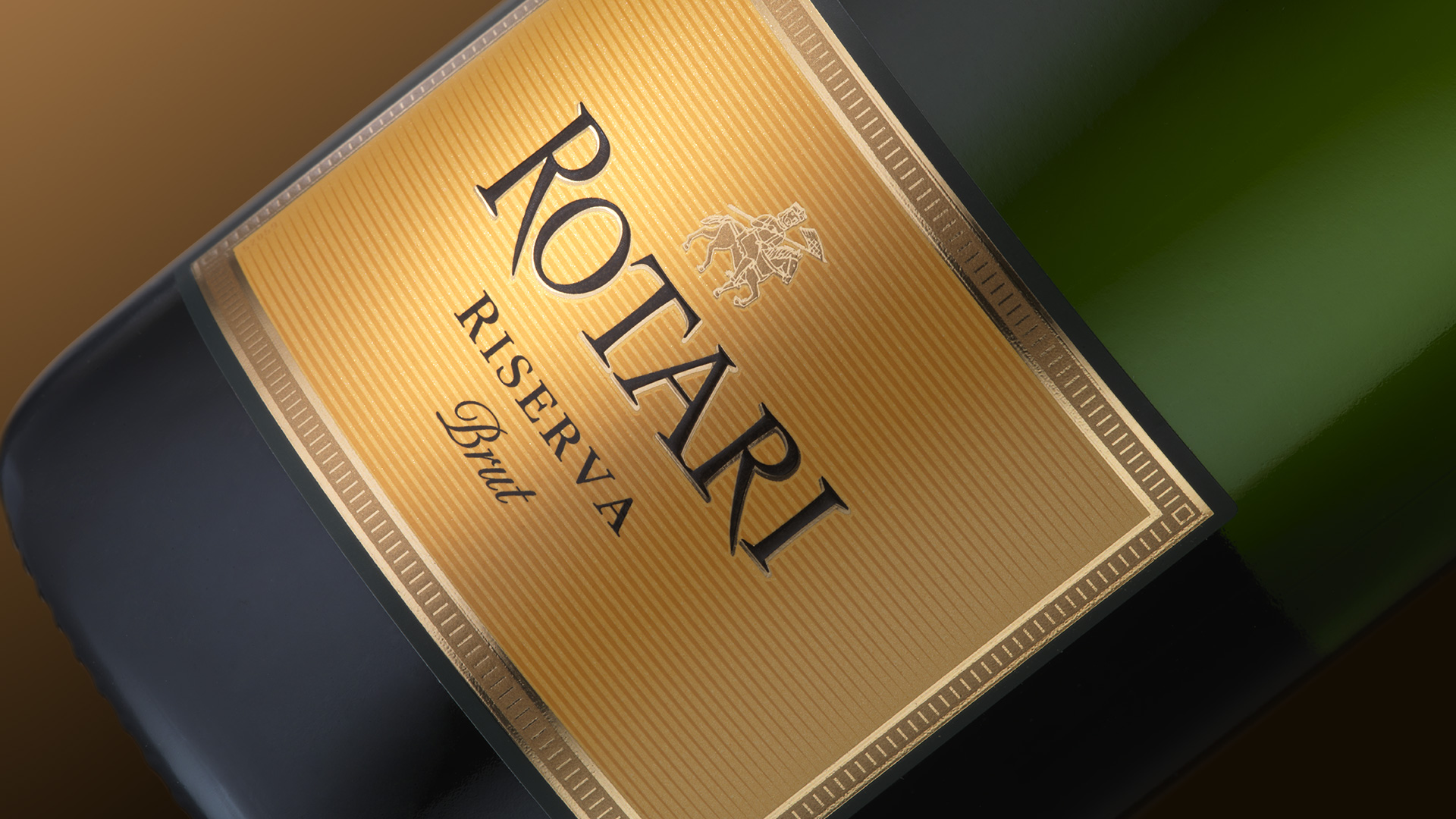
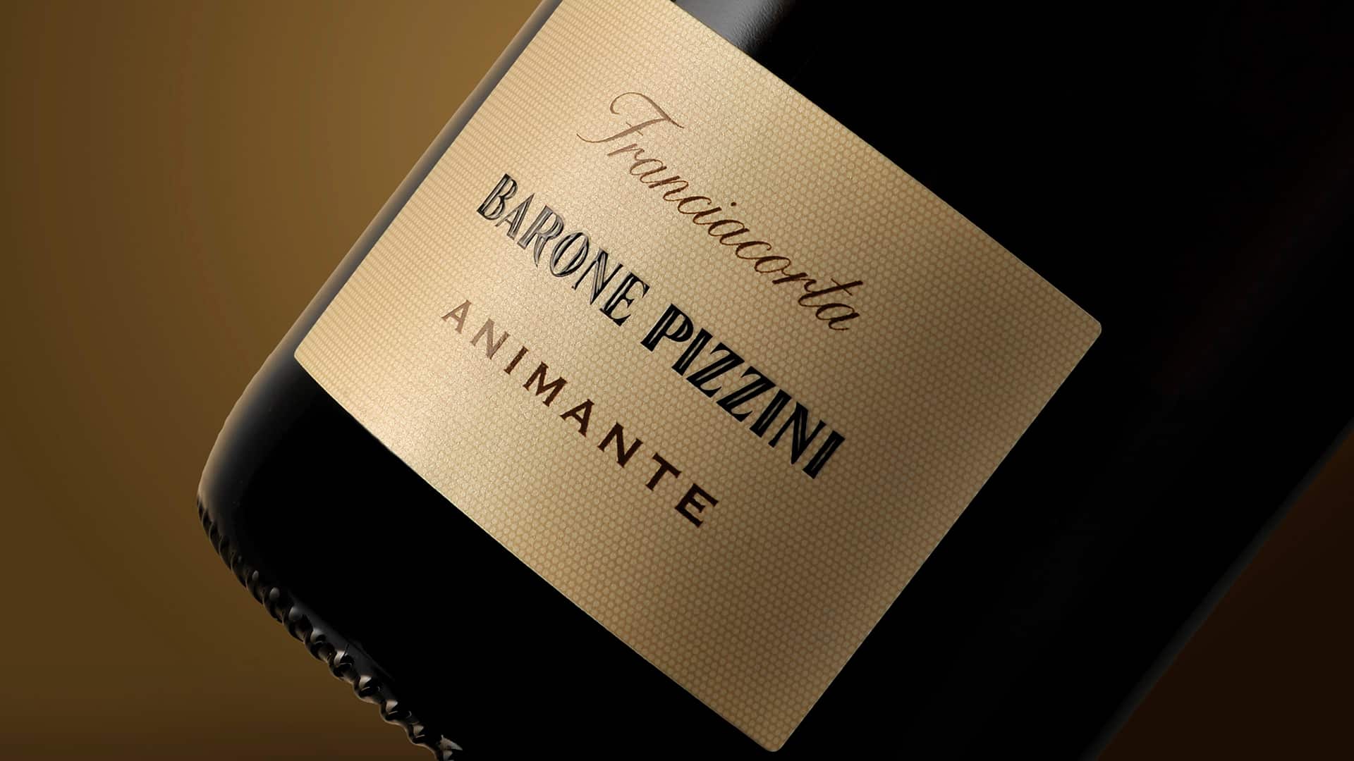
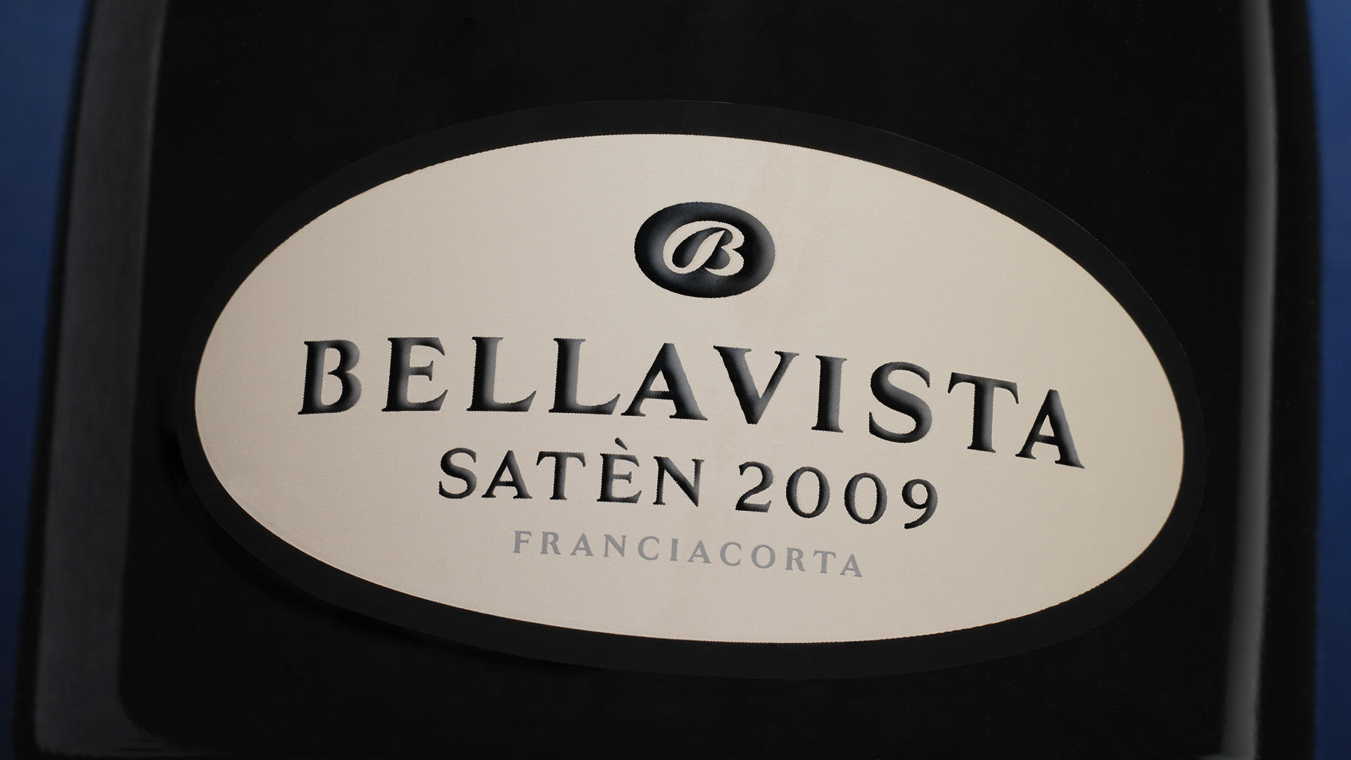
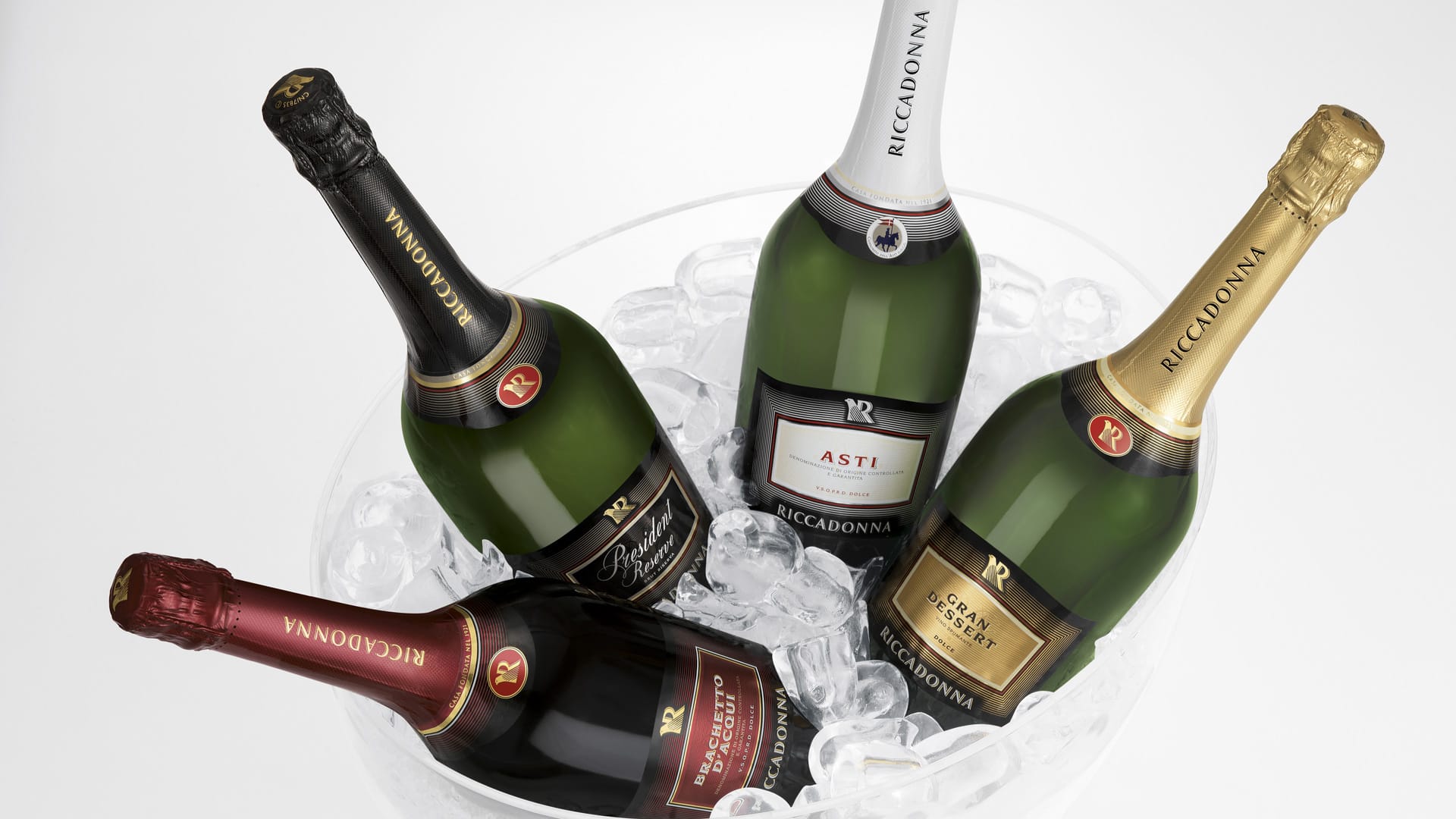
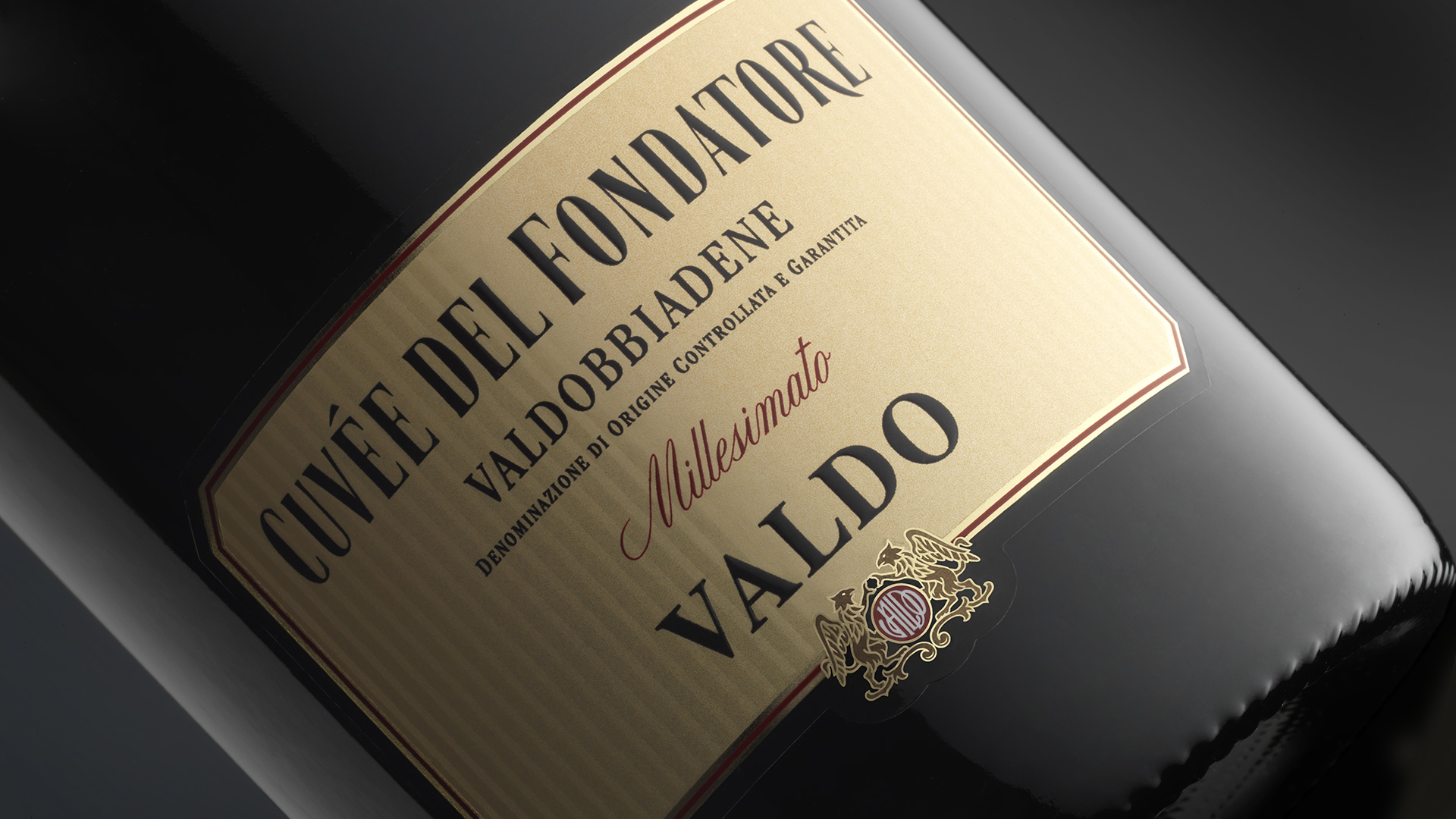
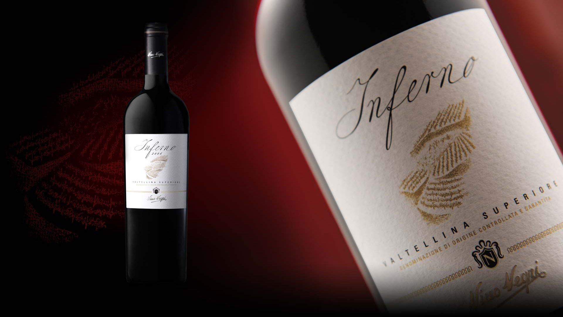
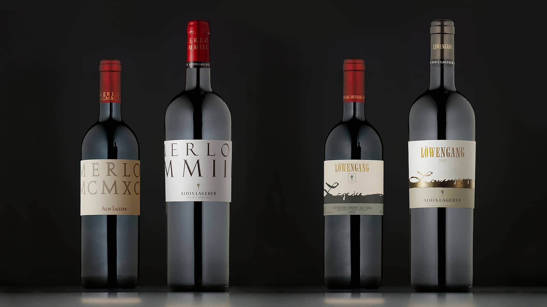
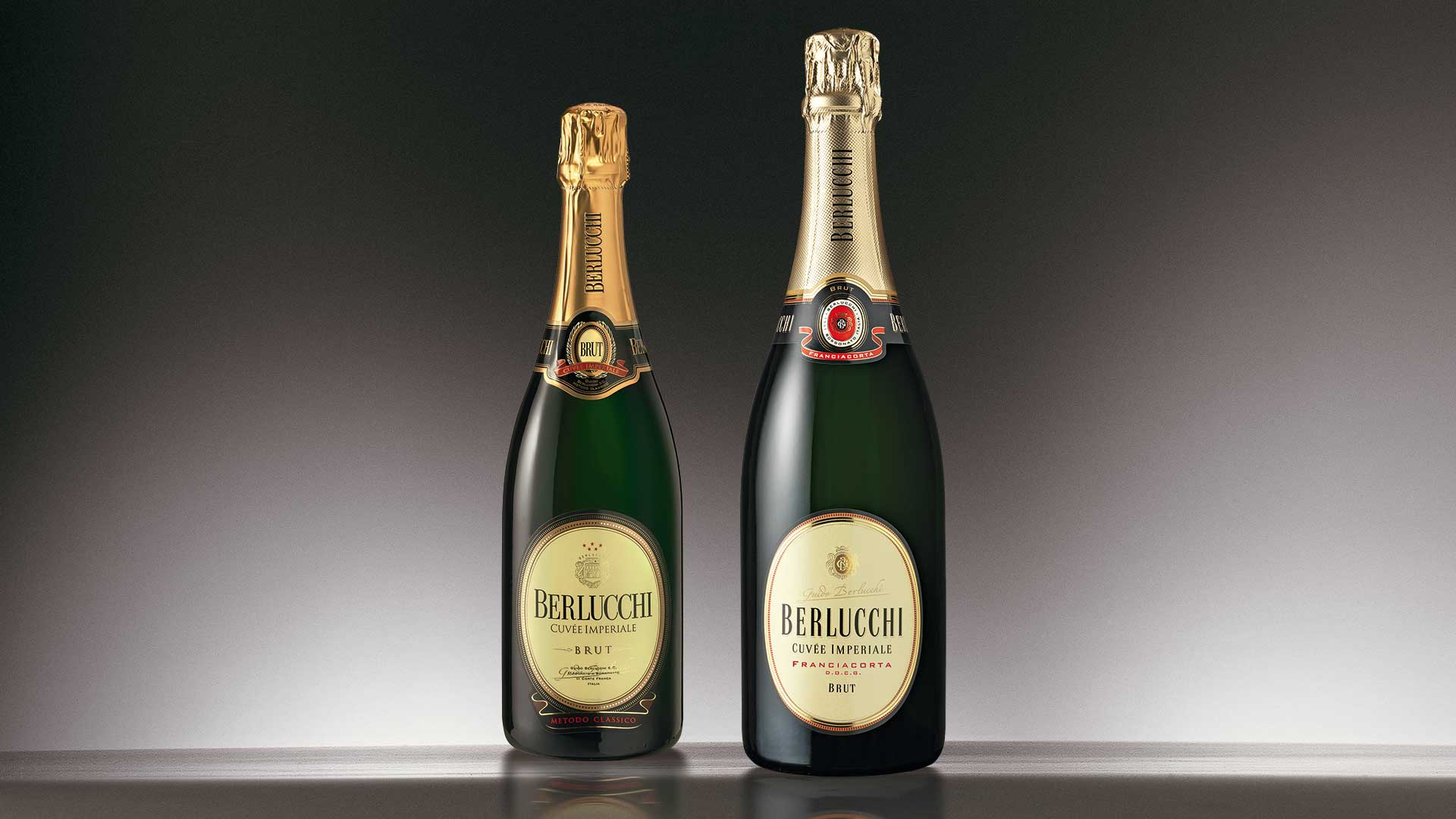
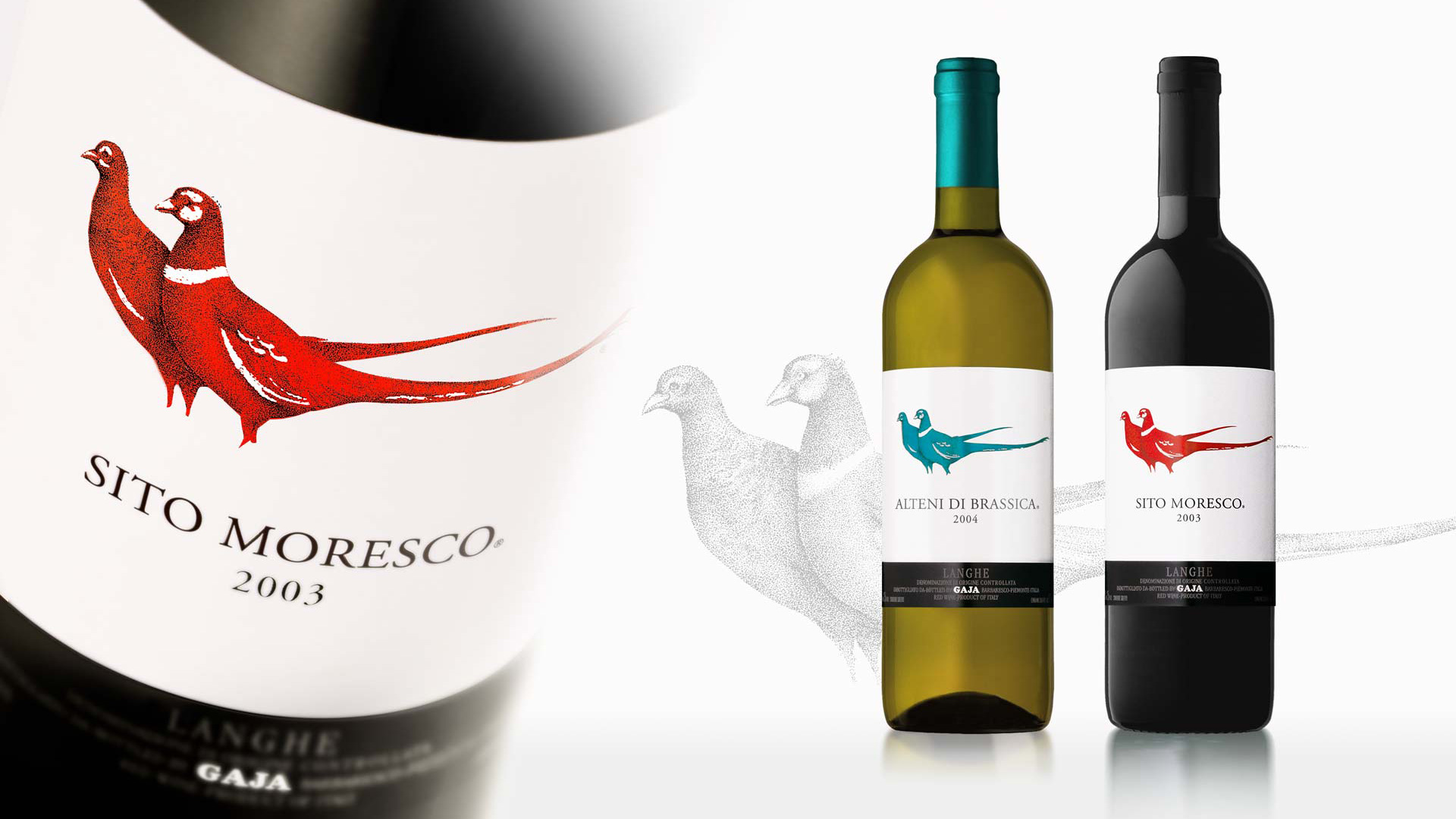
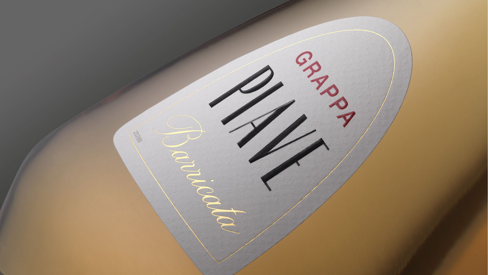
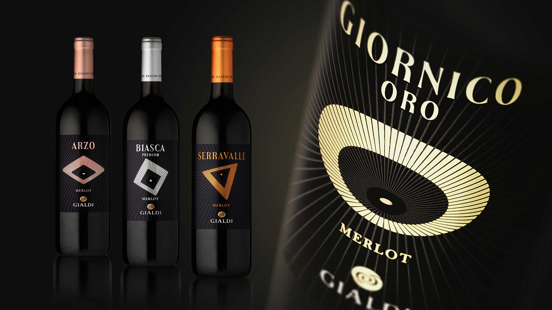
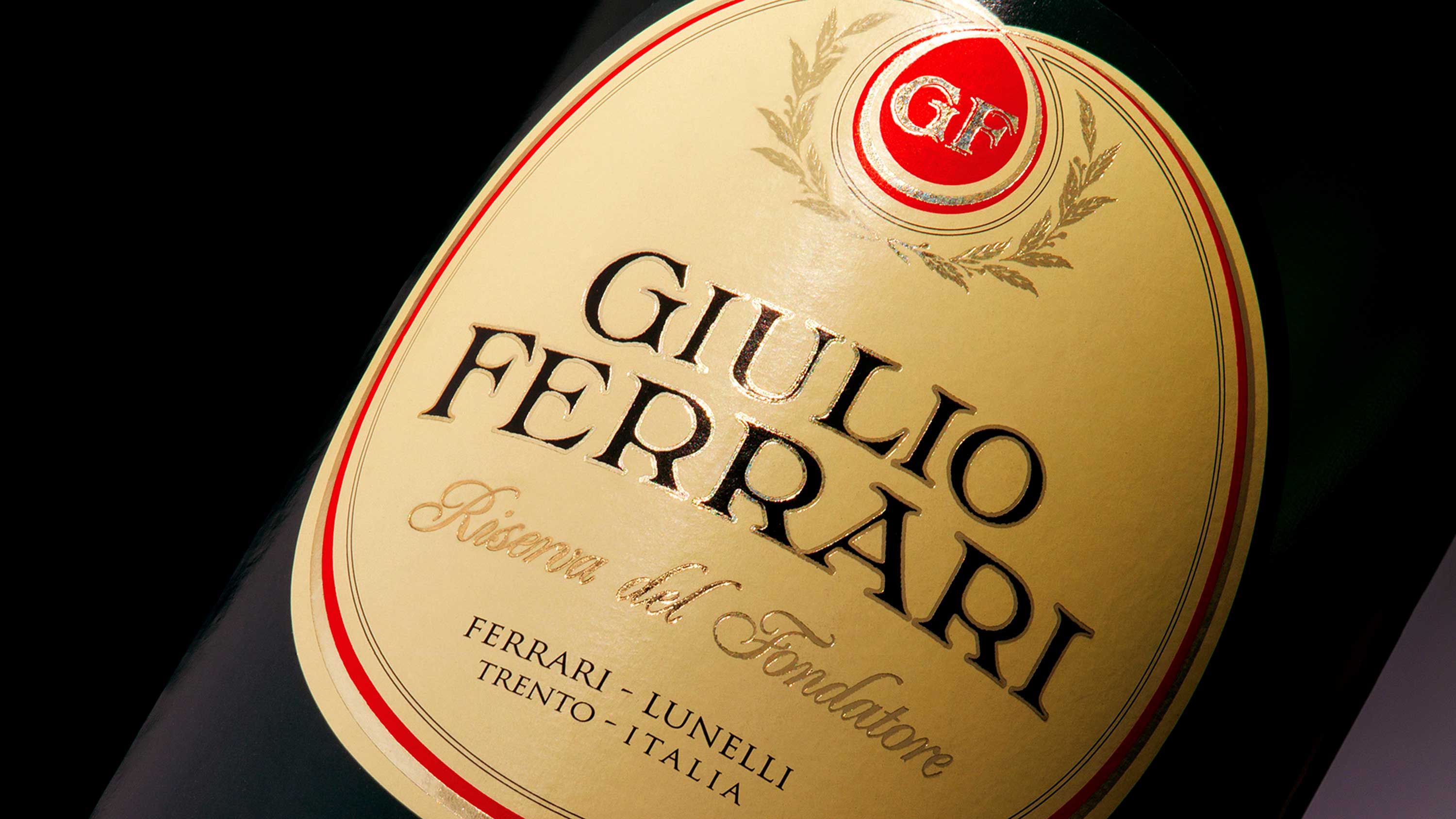
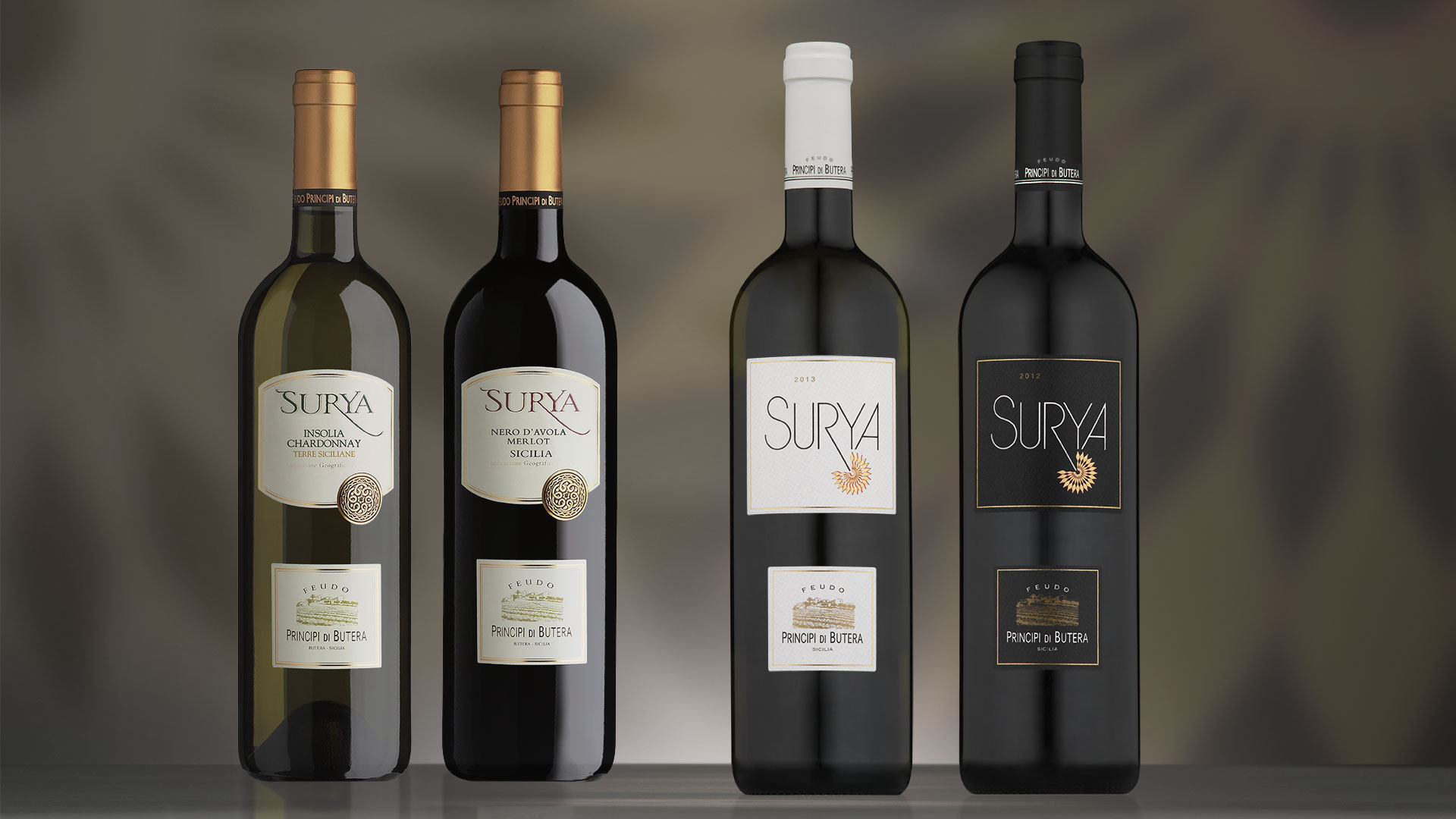
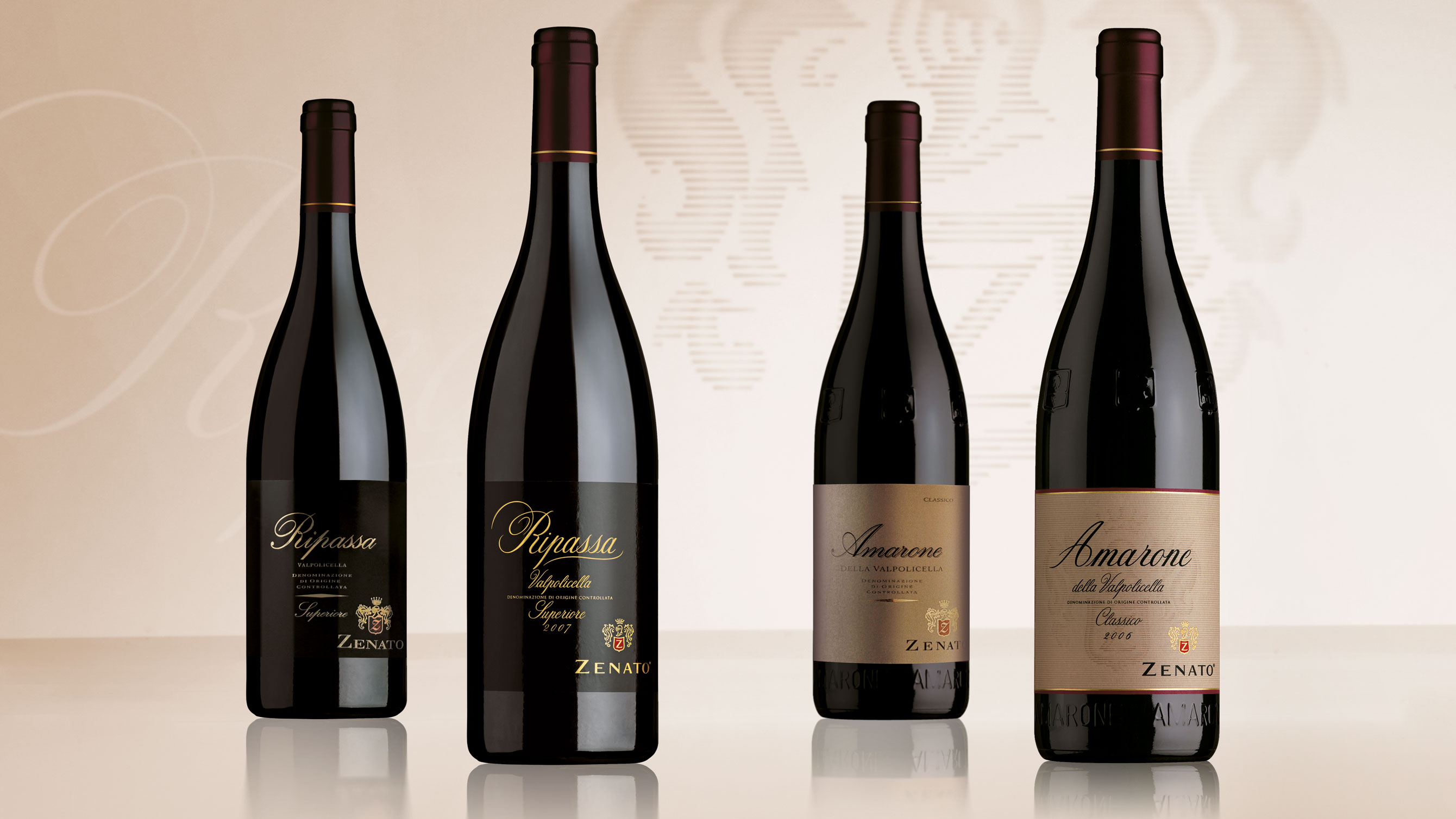
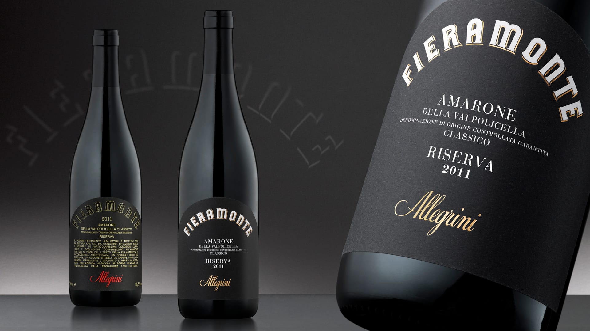
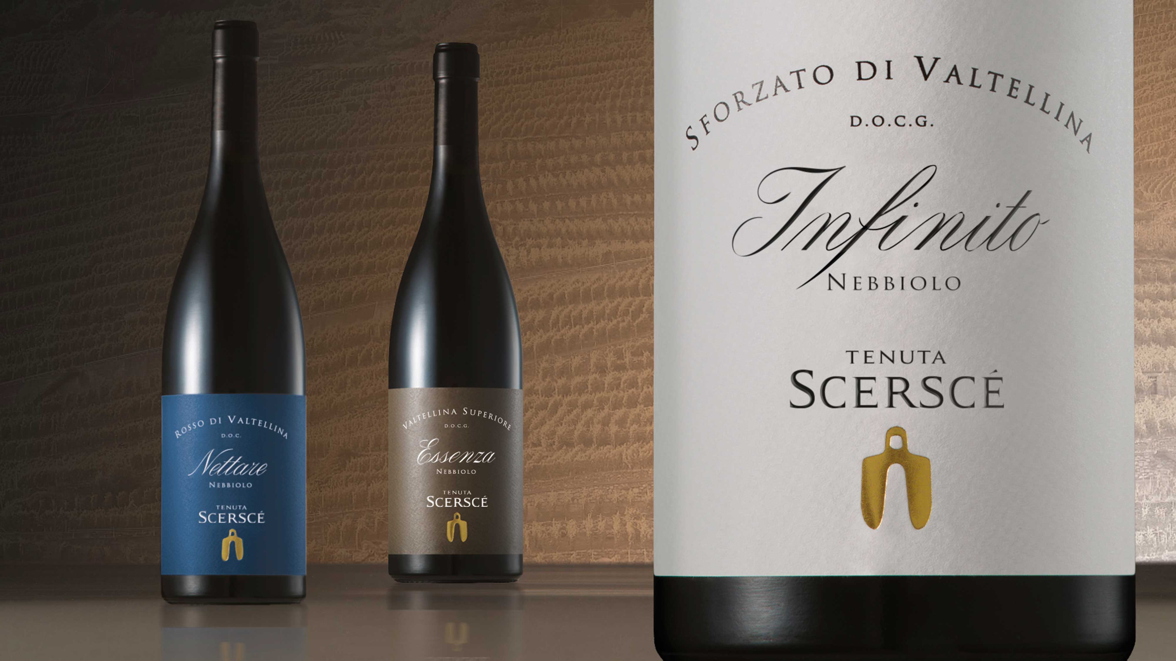
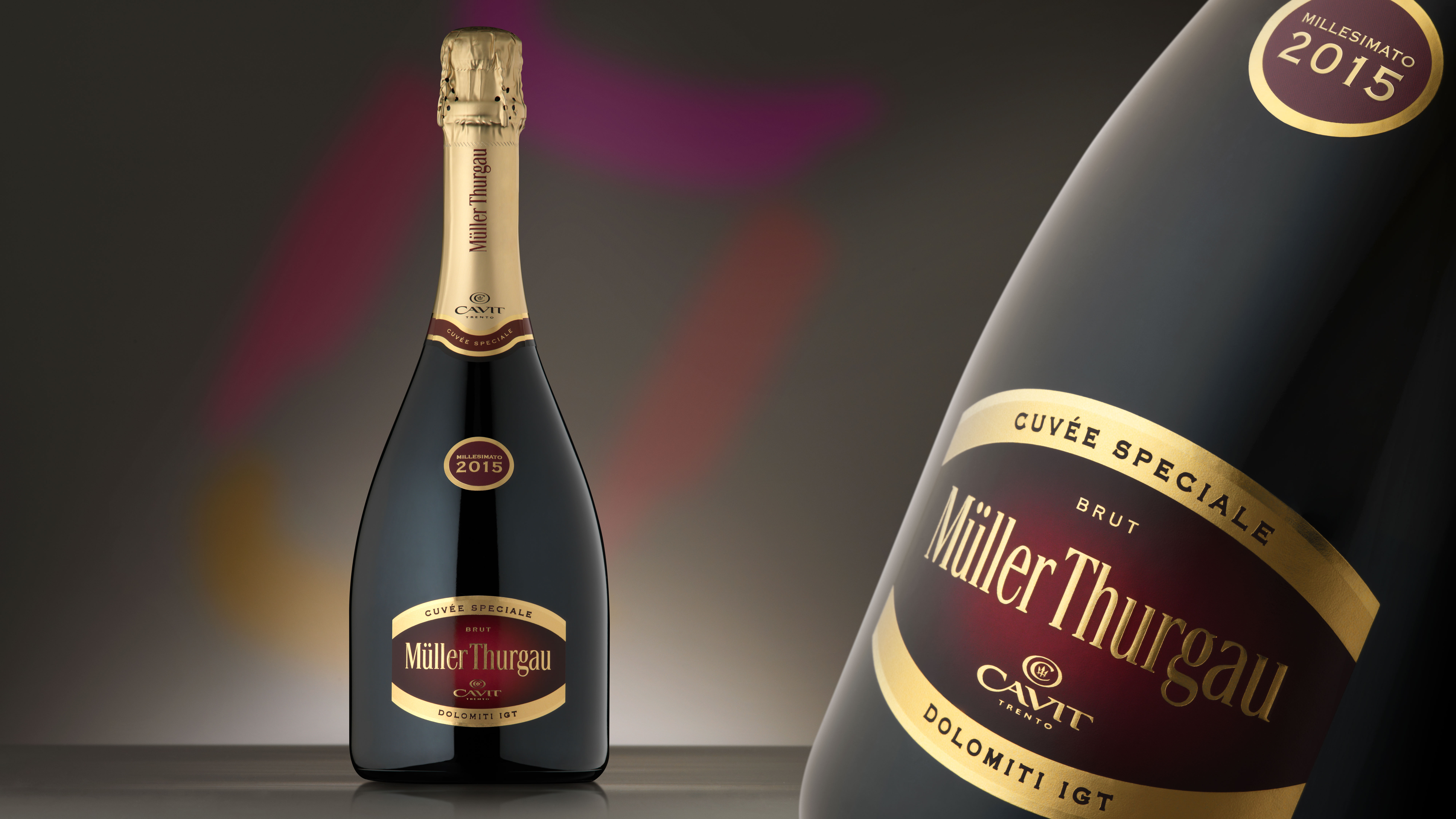
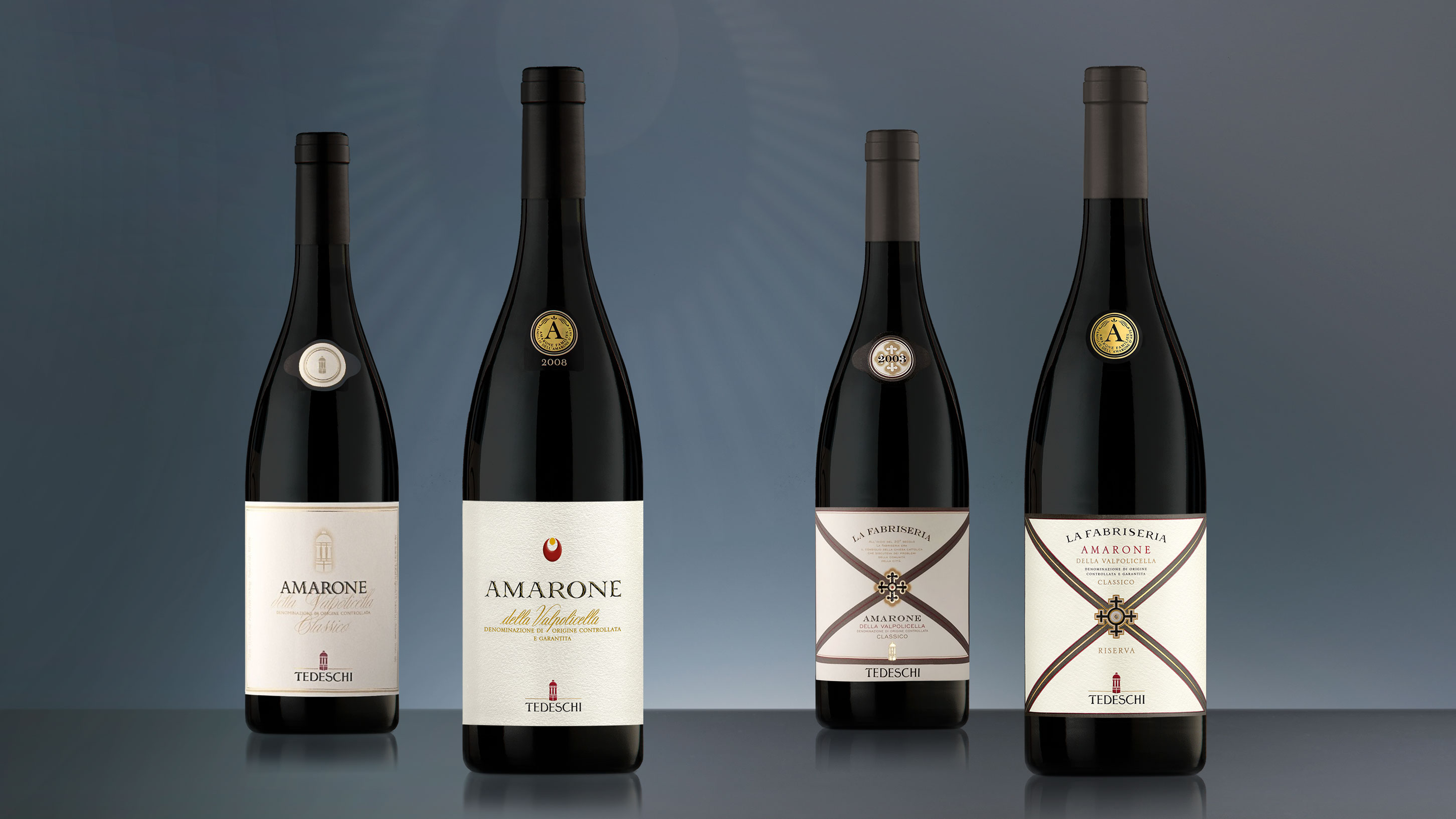
The recognisability of the bottle on the shelf and the prestige of the product in tasting, achieve the correct interpretation starting from a unique design matrix. The project involved the product destined for the traditional channel as much as that distributed in the modern channel, to create the right distinctiveness. The packaging destined for large retailers underwent a restyling that redefined the format of the label and the space reserved for the rosette.
This element was completely redesigned and improved using tonality and a weave of curved lines with the aim of giving more three-dimensionality to the space. The packaging becomes more visibility, character, and personality, thanks to the living red thread that embellishes the label and the collar, which has also been made more harmonious and linear. The intervention constructed a packaging that proposes a more current style, while maintaining the authority and elegance of the brand.
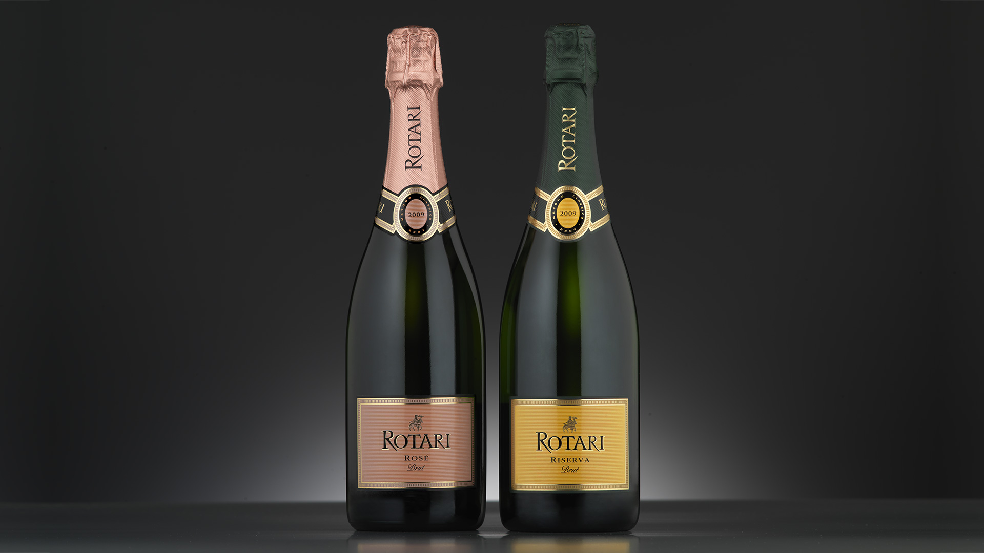
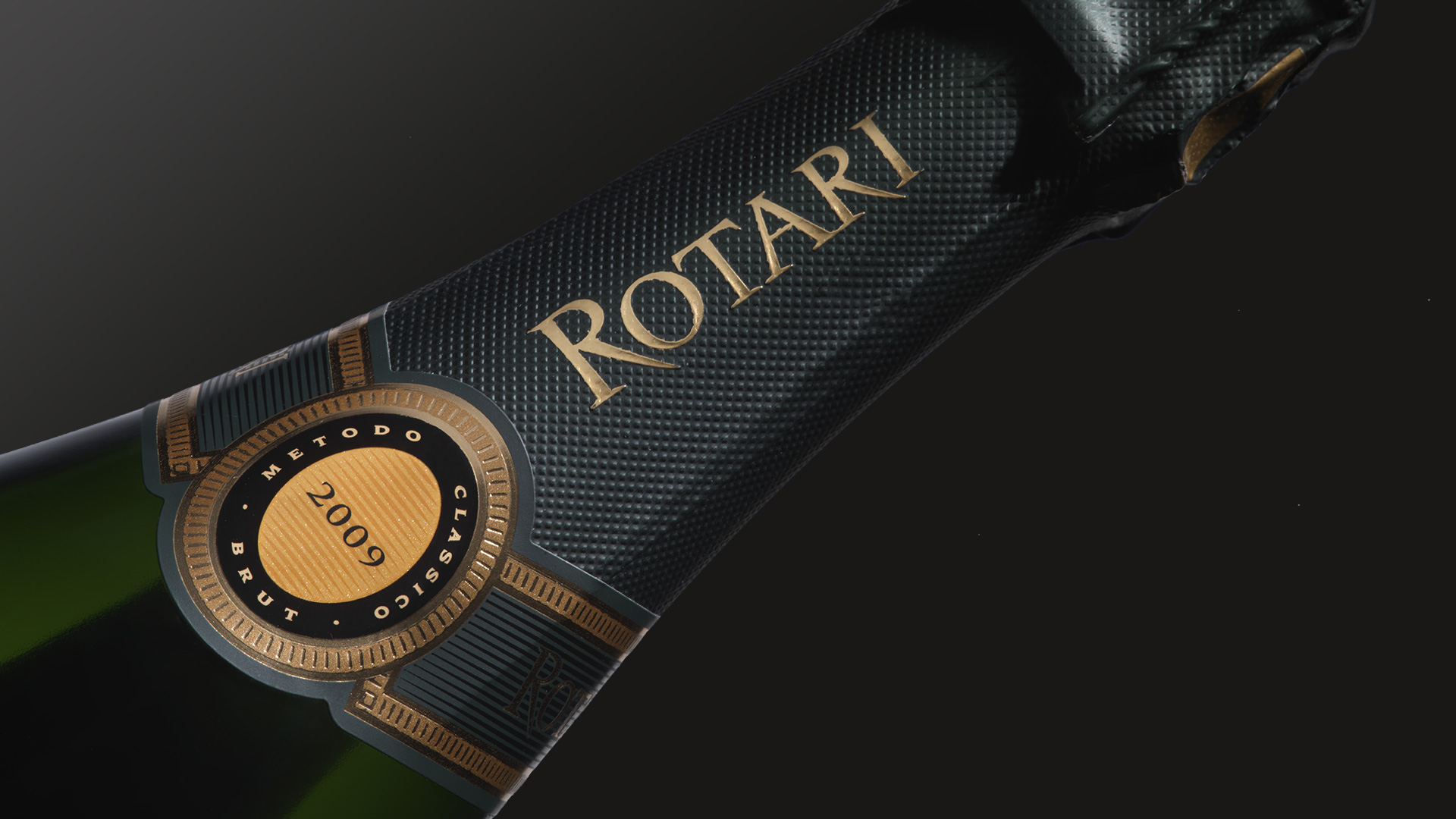
We recently redesigned the packaging for the Riserva and Rosé products destined exclusively for the Swedish market.
Activity: Restyling


