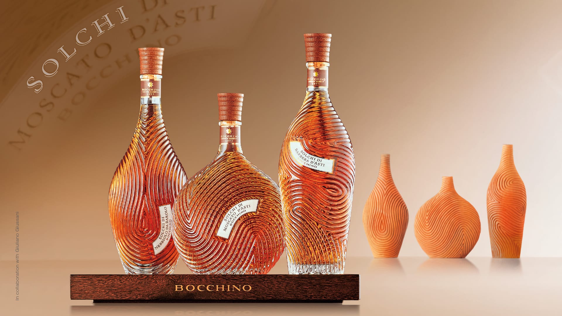
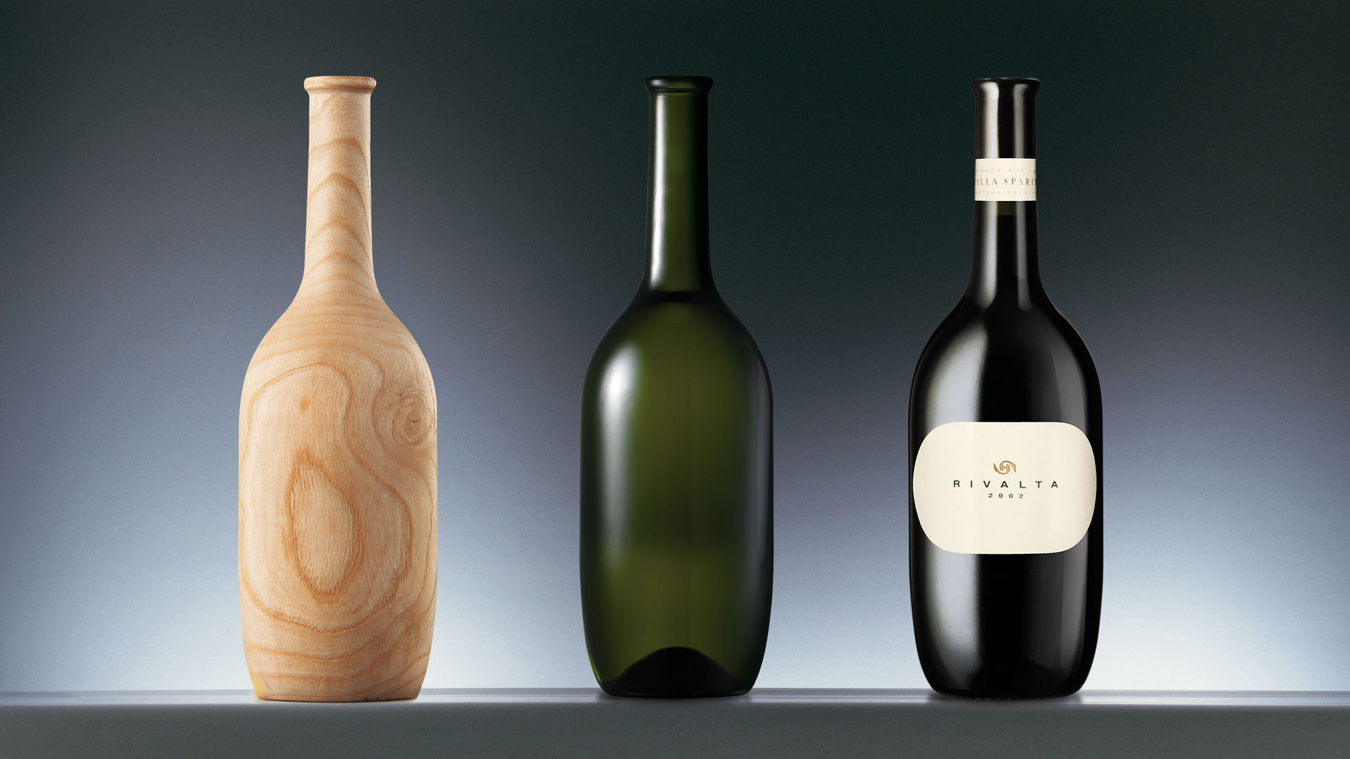
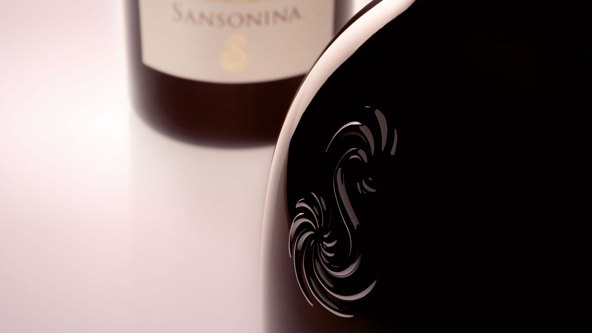
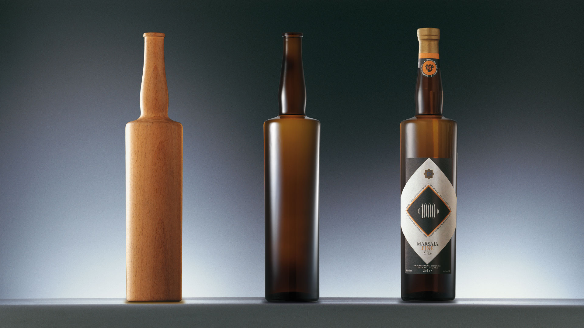
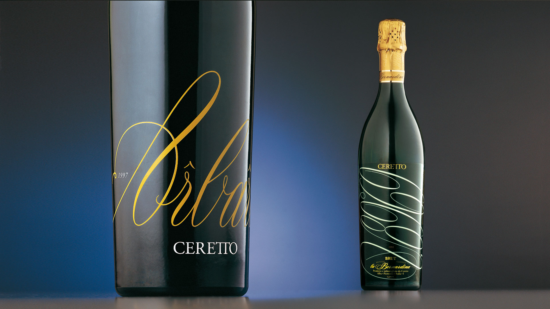
For the project for the “Solchi” line, we collaborated with the sculptor Giuliano Giussani. The three different forms, designed to differentiate the different types of vine, we made with furrows that embellish the surface of the bottle. They are marks that recall the working of the earth and the rows of vines. To achieve the perfect integration of the elements that make up the packaging, the form of the labels too was determined by the curvilinear progression of the lines. In its particularity, the project triggers a sensory experience of touch and sight.
Activity: Branding, Packaging, Bottle Design
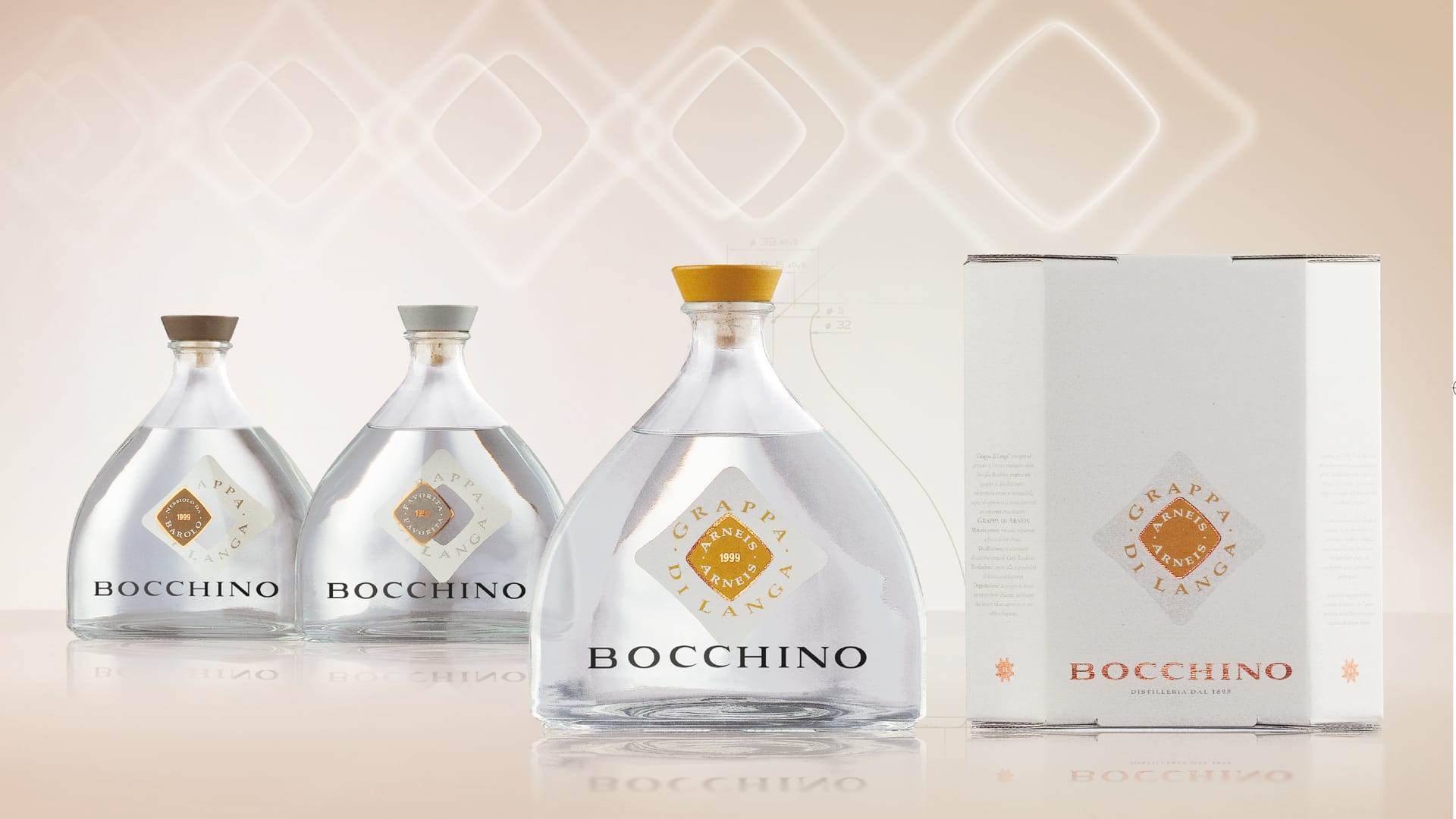
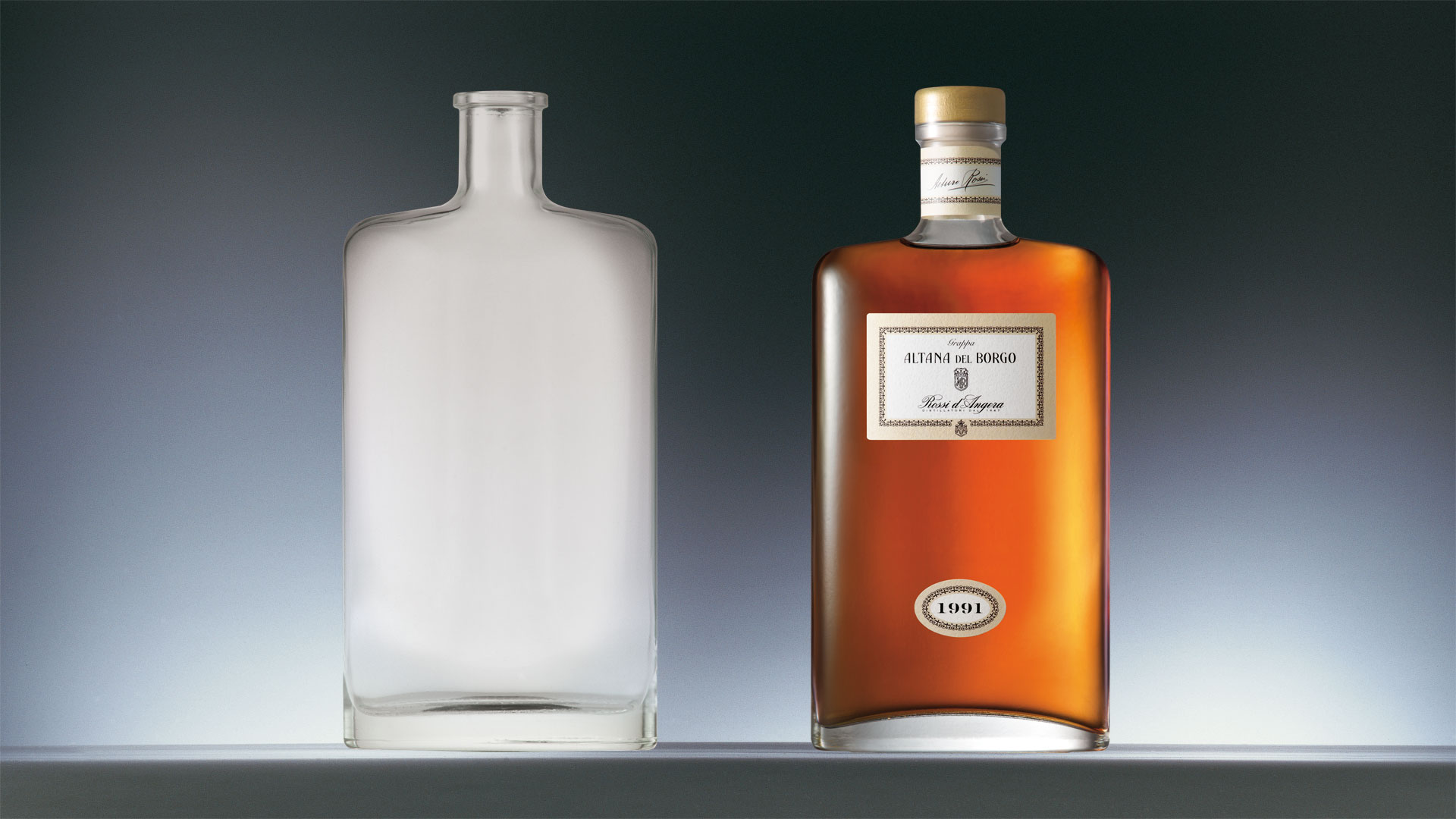
The bottle project for the “Grappa di Langa” line was born with the aim of developing a packaging that evolves the traditional aesthetic codes of the brand in an innovative direction. The traditional flask is re-proposed with a more modern and minimal profile, while its characteristic “squashed” shape allows us to distribute the various elements of the label over several levels. The cap follows the profile of the bottle and chromatically differentiates the different types of grappa.


