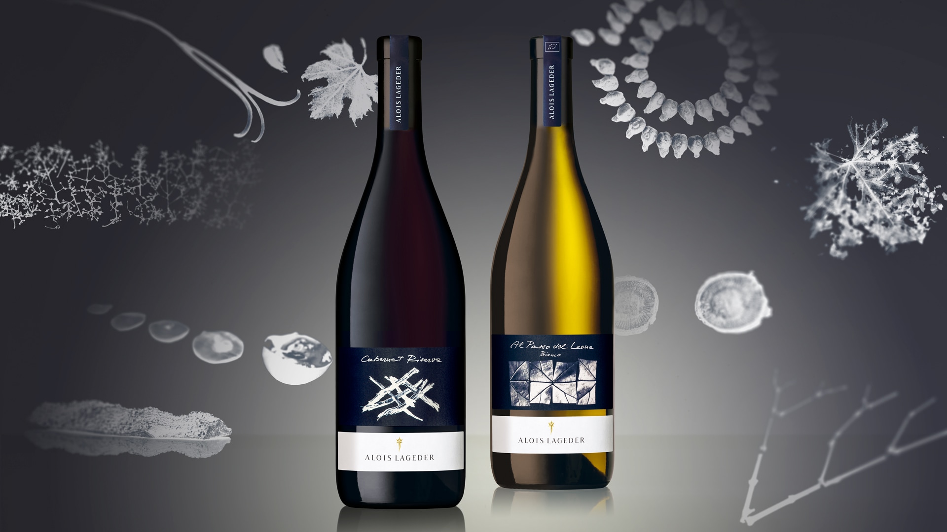
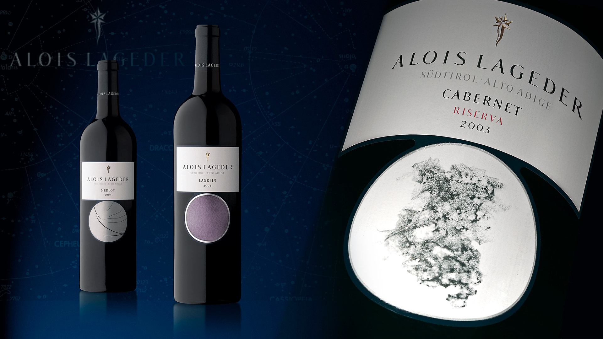
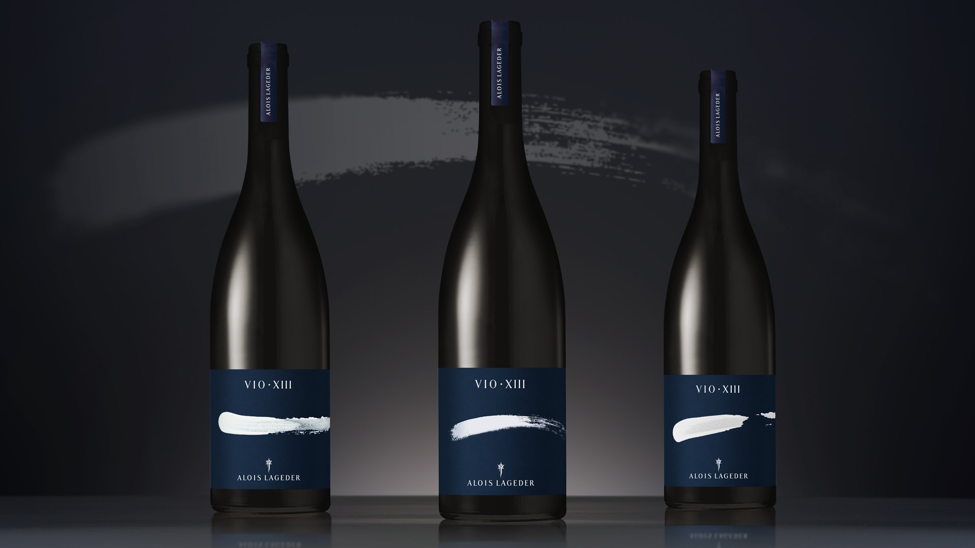
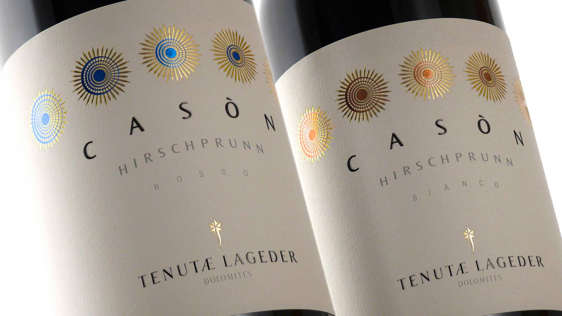
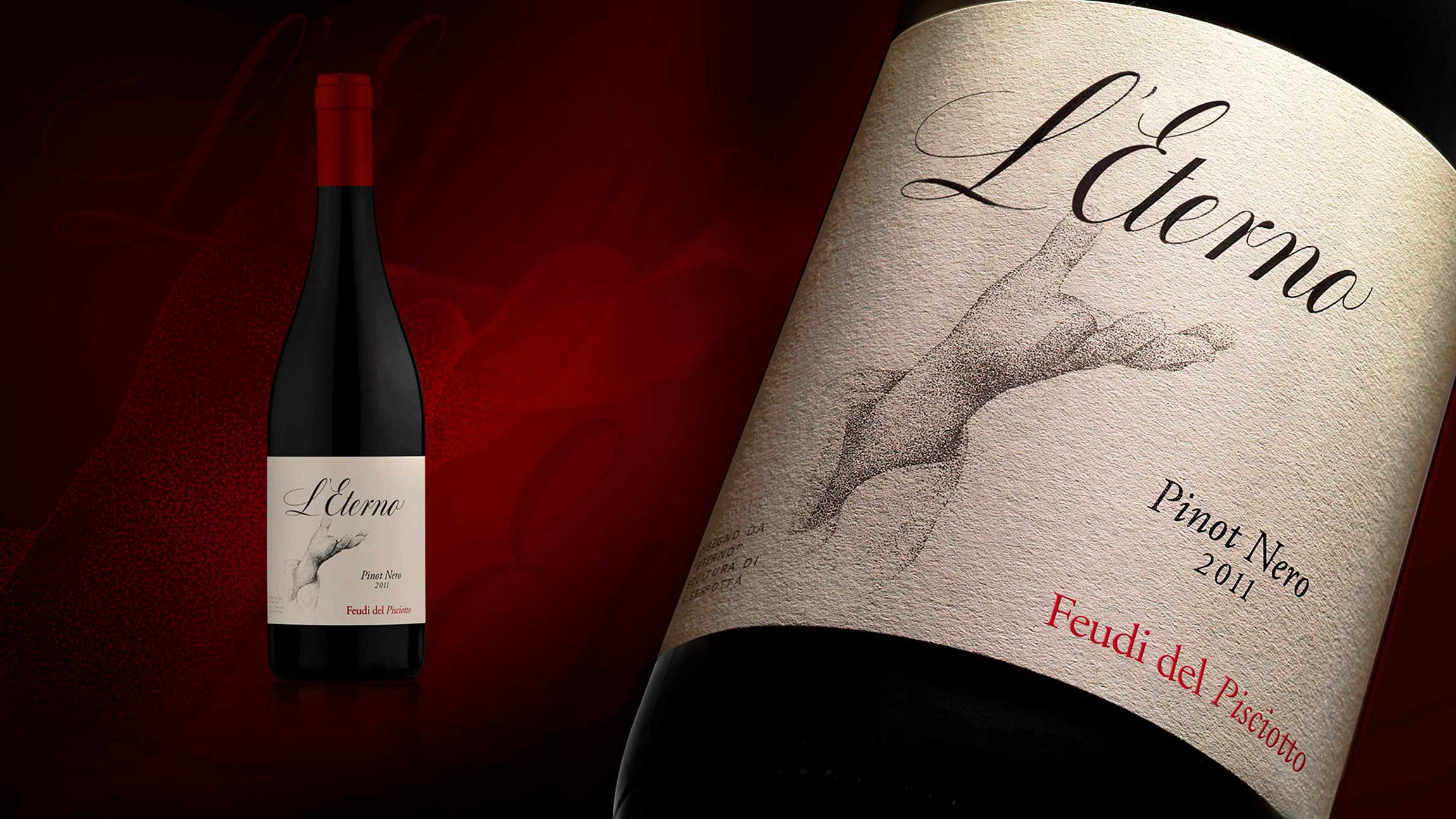
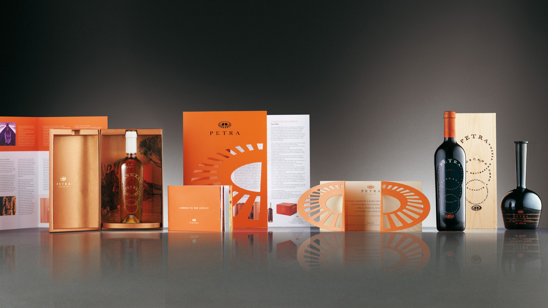
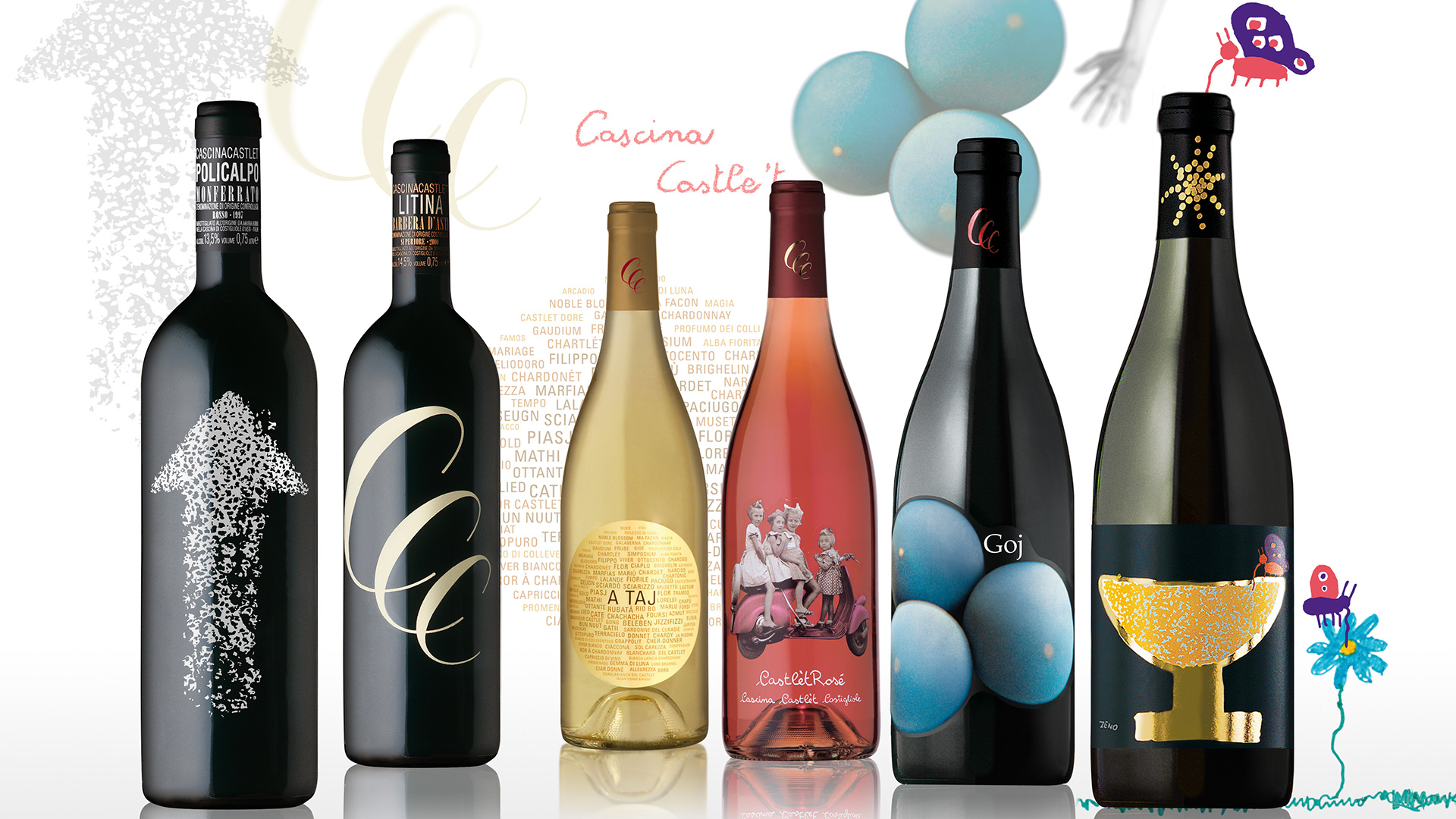
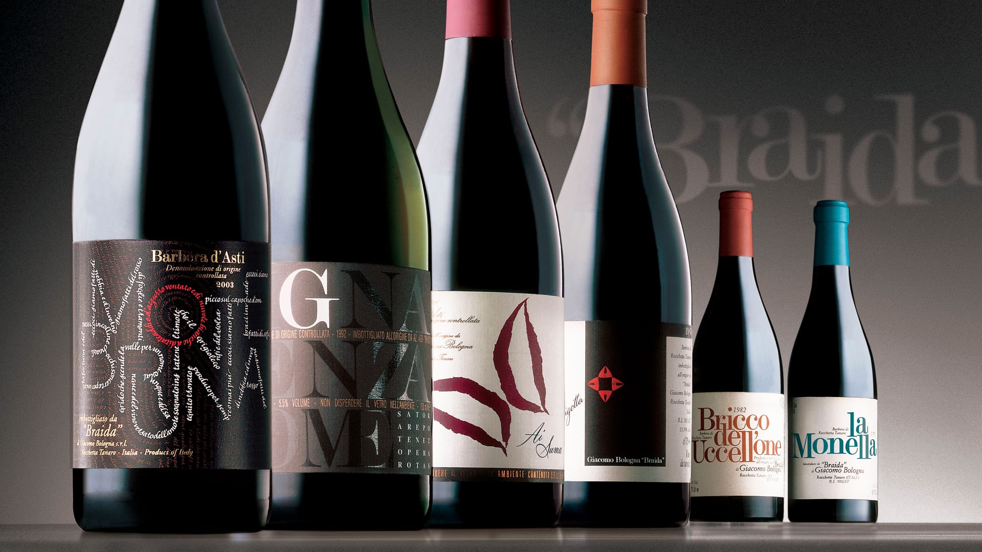
The design of the new labels of Alois Lageder’s line of ‘classic’ wines began with the analysis of the complex system of values to which the winery aspires and that guide their operational decisions.
Each value, selected for its cultural and literal definition, was identified with great care and the awareness that each one must relate to the others.
The creative solution that emerged from the various explorations is an expression of these values through the unconventional use of natural elements found in the vineyard: shoots, leaves, stems, bark, seeds, grape skins, etc. The concept behind the project was to transfigure these humble materials into strongly iconic images.
Each concept/value was interpreted visually, giving rise to a sort of alphabet, a form of scripture, created by ‘playing’ with the elements and geometric structures with symbolic significance.
In line with the concepts of naturalness, authenticity and immediacy, the 15 images together recount the complex system of values that this winery represents.
Activity: Branding, Packaging, Secondary Packaging, Restyling, Global Design
- Conferenza Museion Bolzano Comunicare la cantina tramite l’etichetta
- L'architettura della cantina Identity, evoluzione dell'architettura


