2011 - Wine and Design
Immersed in design
The first contact a consumer usually has with a wine is through the label, which means that design matters. We spoke to three design firms about their very different philosophies. Here, Massimiliano Hangler from SGA in Italy outlines their approach.
SGA is an Italian brand and packaging design agency with a focus on the wine and spirits business. Founded 25 years ago by art directors with backgrounds in both art and corporate design, the agency’s aesthetic links corporate branding to artistic expression. SGA mostly works for Italian companies, but has done some work for companies in the USA. Clients include Bellavista, Campari, GIV, Berlucchi, Gaja, Valdo, Fontanafredda and Ferrari, among many others. The agency’s philosophy is ‘give shape to value’, which is our motto. When we begin working with a winery, we go there and speak to the winemaker and try to understand the winery’s soul. I am not speaking about ‘mission’ and ‘vision’ and all those marketing words, but about understanding how the winemaker lives his wines, how he wants to get on the market and how his customers approach his wines and the category. After doing this, we usually get the concept. From our point of view, there is no difference in approach to Old World and New World. The important thing for us is to express what the wine is. When we visit, we talk with a lot of people. Afterwards we try and extract elements from that experience. In one case, Ceretto’s Grappa, we found a church in the vineyards that had an artistic work that was very colourful. We used the same colours for the label. We give the customers a piece of the winery experience. The communication is true, so the customer finds on the label what he finds on the ground of the winery. The important thing is to be true to the customer and to express something that is clearly different from competitors. When we start to work on the project, we get all the bottles and design labels of the main competitors. The main advantage is to avoid copying, but also to understand how much you can stand out from the rest of the labels.

The importance of story
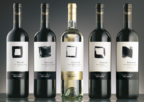
We have a lot of experience in the wine market and understand the vineyard language. Piedmont has a label language, Tuscany has another label language. You have to be part of this, but if you only use that language, you will not stand out from the crowd. For example, we rebranded a Piedmont winery, Enrico Serafino, for Campari. It had a typical Piedmont look, but it was old fashioned, so the market got bored. Campari began to rebuild the quality of the product and we rebuilt the imagery. We searched in their cellar and found a letter from the first owner. We used that to rebuild the wine’s image. We designed a font based on the handwriting in the letter and also focused on some elements of the region, Roero; it’s like Barolo but it’s a new one. From old pictures we saw that the main characteristic of that firm was that a train could stop in front of it. There were oak barriques all over the front of the company, so we linked the handwriting with the two first letters ‘E’ and ‘S’ in the brand. We wanted the design to give some fresh energy to the sales force, as well, because they are so important. They took the new brand all over Europe. We do not have precise sales figures, because the company is listing on the stock exchange and can’t give numbers, but they said there was an improvement in sales and orders around six months after the new image was presented. It also won a prize at Vinitaly last year. Because we want to create value, we also did a document that explained how the image was built. This was to we give the core team the idea of the project, because in wine, narrating a story is very important. Everybody needs a story, that’s clear. If you have got an interesting story founded on the winery’s history and you can show what the winery did to improve its quality, it lets people get in touch with something authentic. There are many quality wines out there, so it is important that they each bring something different. Our clients are very happy when we give their wine some additional value, to help express the quality of the wine. When the bottle goes into the sales channel, there is no one supporting it, but they know that the product can speak for itself.

Archetypes
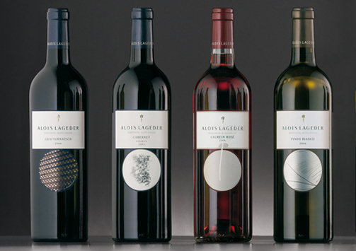
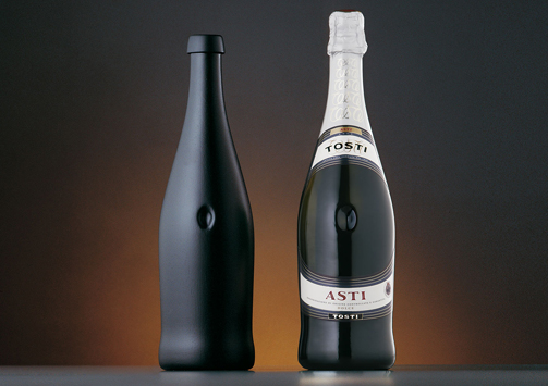
To create a long-term relationship between the customer, the bottle and the winery, we try to introduce some unconscious elements into the label that can speak to the customer. We use archetypes; we did some cultural research and found out that there are shapes that people all over the world associate with the same things. So when people see a square label or a square shape, they associate it with the earth. If you are talking about vineyards, you can use a square shape to tell them there is a deep link with the earth. We worked on a bottle of Tosti, which is a sparkling wine. We shaped the bottle so it had a belly on it. The reason we chose that shape is the bottle was going to be sold all over the world and the belly can be found everywhere. You can see it in ancient objects that have been found in Africa. Everyone is familiar with the archetype. We shaped the label around the bottle so when these bottles go on the shelf, there is always unconscious communication between the customer and the product. Another project we did was with Alois Lageder from Trentino, which had an oldfashioned product line with old-fashioned labels. In this case, we organised a contest with modern artists; we brought them around the winery, we made them speak with the winemaker and we told them to create a team to express the winery. This main thing with this winery is that they try to have as little impact on the environment as possible. They are biodynamic. At the end, we collected all of the art papers and chose teams to express what the winemaker is doing with his wines. When you see the pictures, you will see there are two archetypal elements: the circle and the square. The circle is an archetype of the sky and it can also express the continuity of nature. This means if you are biodynamic you respect the environment and have a circular life – if you use a lot of chemicals, on the other hand, you cannot have circular growth, because you will have to keep on using chemicals or have no fruit. So you see, these labels have three levels. The first is that they are nice to see, because they have art work on them; the second is that they express nature. In nature there are four themes: the ground, the wine plant, the wine maker and the wine itself. For the ground the artist’s work was about putting a stone on a paper and to brush it, so we got a label with an image of the ground that gave birth to the wine. The second label has a stylized vine leaf on it. The third step is that you can find the handprints of the winemaker on the label. This is a very modern design and it replaced a very old design.
The export manager was afraid to put this wine on the US market and also on the Italian one, because it was a break from the past. But in this case the label had a very interesting story to tell, because when you talk about how the artists worked, you are proving that we are really authentic. In the end they went with the label and the result was that they sold out.

What not to do
The most common mistake is copying. If you go to a territory like Piedmont and visit maybe two or three of the wineries which have no conception of branding, marketing or design, you see they look the same. Maybe they have looked at each other, or looked at the leader, to get their design elements, but in doing this they are only working for the leader. They are reinforcing the leader’s ideas. Another very common mistake is to try and design something so new and unusual that is has no substance behind it. The third mistake is making a very nice design when the wine itself is not so good. Sometimes for the international market we are asked to design different labels for secondary lines. In this case, you can choose to design a label to be seen as typically ‘Italian’ and many do this. But nobody will remember your label or your brand, because you have made yourself into just another Italian wine. So even on the international market, we still prefer to design in such a way that it expresses the winery.


