Design Tribune Magazine: Packaging is a supermedia.
Wine is a product inevitably linked to time. How much and in what way does this characteristic impact branding and image strategies?
It’s true, time has an enormous impact. “How much and in what way” depends on several factors that concern both culture and production: for example the clarity,completeness, and the profundity of the company vision, but also technical aspects like how the wine is matured, can condition the evolution and launch of a new project. Time is determining during the design phase for the dynamics and because we like our projects to have longevity, which is indispensable for the development and consolidation of a company or product identity.
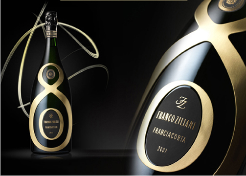
Riserva Franco Ziliani Berlucchi, Special Edition
Can you tell us about your most recent projects?
The project for the Alanera wine of the Zenato company, designed for distribution on the US market, was developed in a limited period of time thanks to a concise dialogue with the representatives. The objectives included the development of a packaging that was attractive on the shelf and prestigious for the hotel and restaurant channels; that could convey the values in which the company recognises itself and create a dialogue with a highly diverse consumer base. We began the project by identifying an incisive and memorable name, which contained a reference to the type of grape and was evocative of the territory while also conveying the product’s strong personality and elegance. The packaging, from the selection of the bottle to the label design, is distinctive and striking while meeting the same universal objectives for the project.
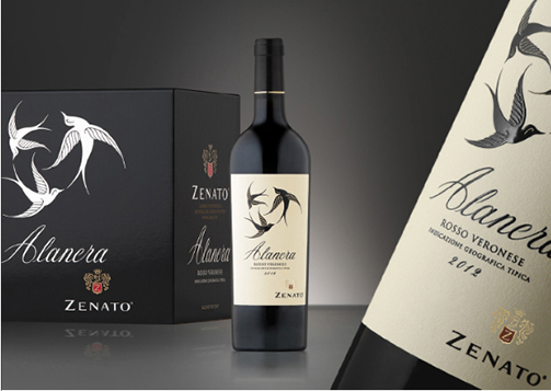
Zenato Alanera project
Your studio largely deals with branding, but also packaging for wine, everything from the bottle to accessories, containers, and packaging materials. What do you feel has been your most complete project to date?
In many of our projects we have worked through the different spheres of communication: one of the most complete projects has to be that for Guido Berlucchi; since 2006 we have developed projects for stands and traditional marketing campaigns (publishing and advertising), brand restyling and architecture, website and events, packaging, bottle design, secondary packaging and limited editions. To remain in theme, we studied the various elements required for the packaging and décor of the temporary corner for indoor and outdoor branding activities.
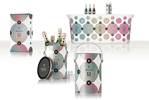
Berlucchi ‘61 project (brand, packaging, secondary packaging, ice bucket design and bar counter graphic design)
Sustainability and transience are two values that often contrast each other. How do you deal with this problem in your project?
We tend to propose the use of materials that respect the latest criteria for safeguarding the environment. Secondly, it is essential that we optimise the use of these materials to avoid waste. We do not promote the assembly of components or materials that would then form an object that cannot be recycled. The reduction of the weight of the bottle and reducing the duration of the packaging phases always moves in the direction of sustainability.
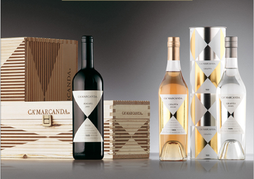
Gaja Ca’ Marcanda project
And how is the wine this year?
It’s difficult to say in general terms.The harvest has suffered this year, but I’m sure the producers have not simply submitted to the adverse weather conditions and have interpreted the particularity of this harvest with the aim of producing high quality wines. Faced with a lower quantity, I think we will see some very interesting wines, even if they are different to recent years. I think they will be surprising.
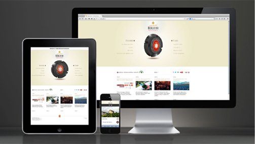
Berlucchi website
Tag Global design, Interview, Packaging, Press


