Marketing a wine according to Angelo Gaja
Angelo Gaja, the artisan of wine
Barbaresco is a small town in the North of Italy. With a population of just 400 people, it is famous for the production of the wine that shares its name. It was here in this tiny Piedmont that we met Angelo Gaja, the owner of a prestigious vineyard, with family heritage that dates back more than five hundred years. Angelo, who defines himself as an ‘artisan of wine,’ produces wine that is recognised internationally as the gold standard in the sector. One of the reasons for this status is that, alongside the excellent quality of his products, Gaja has always dedicated great care and attention to the company image: from the design of the bottle, to secondary packaging, company logos and communication. We took this opportunity to speak to him about the relationship between wine and packaging and how it can increase the value of a historic brand.
Marco Senaldi
I’d like to begin on the theme of communication: from the producer’s point of view, how do you create a brand for a wine, what are the best communicative strategies?
Firstly, you have to offer the best possible quality of wine in relation to the various price bands; then by intelligent marketing, developing the correct and appropriate positioning of the product on the market and giving the label high visibility is fundamental, as is the quality of company communication. It’s important to increase the value of the individual brands (companies, names of wines) as well as drawing value from the common heritage of the IGT, DOC and DOCG certifications. You have to make the most of the culture, history, tradition, modernity and architecture that the territory offers… infuse the wine’s image with the idiosyncrasies of its territory.
And the unstoppable growth of the wine, both in terms of consumption and value… what’s it all down to?
Above all, it’s down to the fact that people perceive the cultural value of the wine much more nowadays. Up tol the 1960s and 70s, wine was the quintessential beverage in Italy, an everyday consumable. Gradually it became an optional addition to a meal and often even considered a luxury item. Of course, there’s still a price band in which you can find wine at two euros, which caters for that ‘everyday’ sector, but from upwards of ten euros (some bottles are sold on the market or at auction for thousands of Euros) wine appeals to other needs and gratifications in a country where this gastronomic accompaniment now has luxury status.
…in today’s globalised world, do you think it’s possible to escape the homogeneity of taste?
Certainly I do!!! – Actually, in my opinion, small artisan producers are what keep the sector so varied. The artisan gives his own twist to a wine. It isn’t necessarily successful all the time, perhaps it’s not appreciated by the critics – but what they want above all is to make wine in their own ways. It’s a choice that only the artisans can make: Mondavi, Antinori, Frescobaldi: the mass producers just can’t do it, because in order to sustain their volumes of production, they have to appeal to 80% of the occasional consumer market – that means it has to make wines with a ‘popular taste’. The artisan, on the other hand, serves a different purpose. They offer variety and abundance to the European market, and Italy in particular.
Well at this point, I must ask you where Gaja fits in here: are you industrial or artisan producers?
To be an artisan you have to meet certain conditions: first, you can’t buy grapes, you have to use those grown on your land. Second, you can’t buy wine, because the wine must be made entirely at the vineyard. Third, there must be a strong family presence, where family members are passionate about their work and dedicate themselves entirely to the wine sector. Finally, the artisan company must establish what will be its optimal size and decide not to grow beyond that. The artisan must know how to resist the temptation to expand further because they know that beyond a certain limit, the quality will inevitably suffer. Artisans don’t appreciate consultants either – they work with the conviction that their own methods are the best. The main objective of the bigger industries is to satisfy the consumer, but for artisans this is not the case – their main objective is to make wine how they want to make it… and that’s why we are artisans. For years, we have kept just our 100 hectares of vineyard: later we bought some vineyards in Tuscany too, but even there we decided not to expand. And then there’s the issue of price. The ambition of every artisan is to create a wine of high quality, and consequently, a high price tag.
A concept that permeates Italian style and makes it so recognisable around the world is “elegance” – would you agree?
I think we need to distinguish the idea of elegance from that of opulence. I’ll explain better: in the oenological sector, occasional consumers are also those attracted to ‘pleasant’ wines, with no edges, not much acidity, they don’t have tannins, have a ‘rounded’ taste and more or less suit everyone. But the concept of elegance doesn’t have space for this unnatural ‘perfection’. Nature creates dissimilarities: there are terrains, even in the Barbaresco area that, in terms of production, are very different. So what appears perfect, is often not genuine. Elegance on the other hand, doesn’t need perfection. Elegance is something to digest then move on, and this goes for wine too. Our wines are distinguished by their lack of this excess, of exaggerated fullness, of this opulence: they can even seem imperfect, but it is that imperfection that is the ultimate sign of authentic elegance.
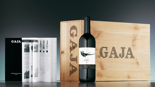
This internal elegance has to correspond to an external elegance… for example, where did the inspiration come from for these ‘fluted’ wooden crates with the Gaja brand? They have a distinct visual lightness to them…
This was an idea developed by SGA precisely because the Gaja brand design was too bold and imposing on the classic wooden crates. The idea was to pick up the style of traditional carpentry common in this area [Angelo takes us outside to see an old wooden door with similar carved grooves to the crates]… it’s a technique that in Italian we call ‘grissinatura’, and it’s an effect we wanted to recreate in our crates to reinforce the link with local tradition.
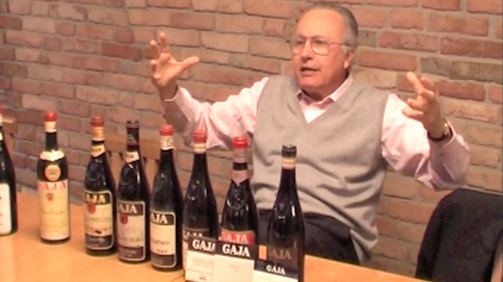
[In the meantime, we moved into the Castle, where Angelo keeps a collection of bottles with historic labels]. Looking at these old labels you can see a certain continuity over time…
Look, this is the first label my great grandfather produced: Gaja Giovanni and sons. Then my grandfather adopted a label in 1900, with the medals that at that time didn’t refer so much to the wine, as to the company that had won a few prizes, gold medals or the merit cross. In 1937, my father reinvented communication for the company: he wrote the name of the producer in enormous letters spelling out “Gaja” grandly above the name of the wine itself. The fact was that he sold Barbaresco at a higher price than Barolo, and this was unacceptable; it was provocative because the gold standard of wine was Barolo. But this price was due to the quality, production methods, and the fact that they never bottled expiring vintages, and so he would say: in this way, in huge capital letters, GAJA had a very precise meaning: “this isn’t just any Barbaresco, it’s a Gaja”. It was an early form of marketing!
The names too are important, a few stand out in particular: Spersss, Conteisa, Darmagi…
We conduct thorough research when naming our wines, selecting them from the traditions of our dialect. Spersss, for example, with 3 s’s, is a word in dialect meaning ‘nostalgia,’ but can be pronounced in different languages.
“Nostalgia” – it was a vineyard my father wanted to purchase, his lifelong dream, which I only managed to fulfil in 1988 when I finally bought the land. Conteisa means ‘contested’ or ‘disputed’, and was a vineyard that lay right on the border between two territories, La Morra and Barolo. It was fought over for almost one hundred years until it was finally divided. Darmagi comes from the French Quel dommage! Meaning ‘what a shame’. This was because in that vineyard cabernet sauvignon was planted, against the advice of my father, to which he replied “what a shame!” (for not having planted them in barbaresco).
In your opinion, what is the relationship between presentation, packaging and the global image that Gaja communicates on an international level?
The label is undoubtedly the primary means of communication between the producer and the consumer. The ticket can help convey the personality of the producer, his philosophies and the ambitions of the company. They contribute to the shape, colour and impact of the bottle… the writing and graphics on boxes and wooden crates, the headed paper and business cards, brochures, flyers, the website, meetings with clients, the organisation of events, presence at fairs, wine tasting events… it’s all communication. The company image depends on the quality of this communication.
Over there I see a brown label…
That was created in the 1970s by a designer who worked for Baratti, a sweet producer based in Piedmont; he used the concept of gold and brown, with the Gaja name in large lettering…
… up to the current black and white label, it’s more sober but striking at the same time…
Yes – from that label there, we gradually arrived at our current black and white design, where the black represents the past, our tradition, and the white signifies the present. It became minimalist, without any decorative images, it’s a ‘tidier’ label – I would define it as “classical modern.”
And the type of paper?
There’s a whole tradition from the 1980s and 90s of using uncoated paper, Fabriano and the like, for wine labels, because they appear softer and warmer. But that kind of paper has two drawbacks: firstly, if a drop of wine runs down the bottle it stains the label, and secondly, if the bottle is stored outside or in direct sunlight, it accumulates dust and loses its colours easily. For these reasons, we eventually opted for a glossier and discrete label.
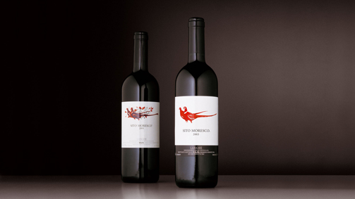
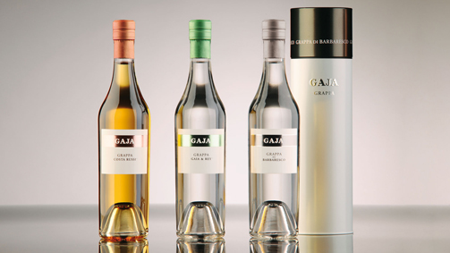
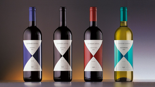
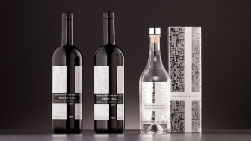
The classic layout and effective communication seem to be a continual themes for the Gaja brand. How did the image and the product packaging evolve in the last few projectsyou worked on with SGA? I’m talking in particular about Gaja’s Ca’Marcanda, Pieve Santa Restituta and the Fagiani d’oro and grappa lines.
Gaja’s old labels were restyled by SGA. They retained what the labels communicated, but ‘cleaned’ them up, minimising the decorative graphics, and thus adding value to what is essential in the label. For the Ca’Marcanda and Pieve Santa Restituta wines, SGA created a label that prioritised visibility, while staying true to the concept of sobriety and minimalism, playing on two colours and standardising the lettering, protecting what was essential.
In one word, what is the secret to an effective relationship between the producer and the packaging designer?
I’m convinced that any design proposals must embrace the history of the company and its philosophy. But a relationship like this can’t be improvised on the spot: the secret to efficient collaboration lies in the time you invest in this relationship. With SGA we have developed a mutual trust that has lasted for years. Thanks to this relationship, we’re able to create new ideas together.
Tag Global design, Interview, Packaging, Restyling


